Howkins
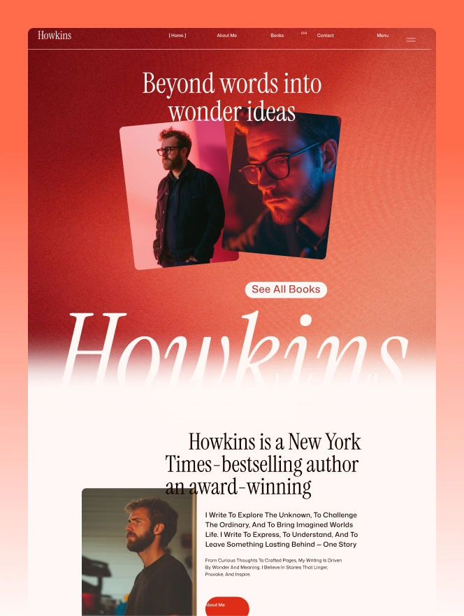
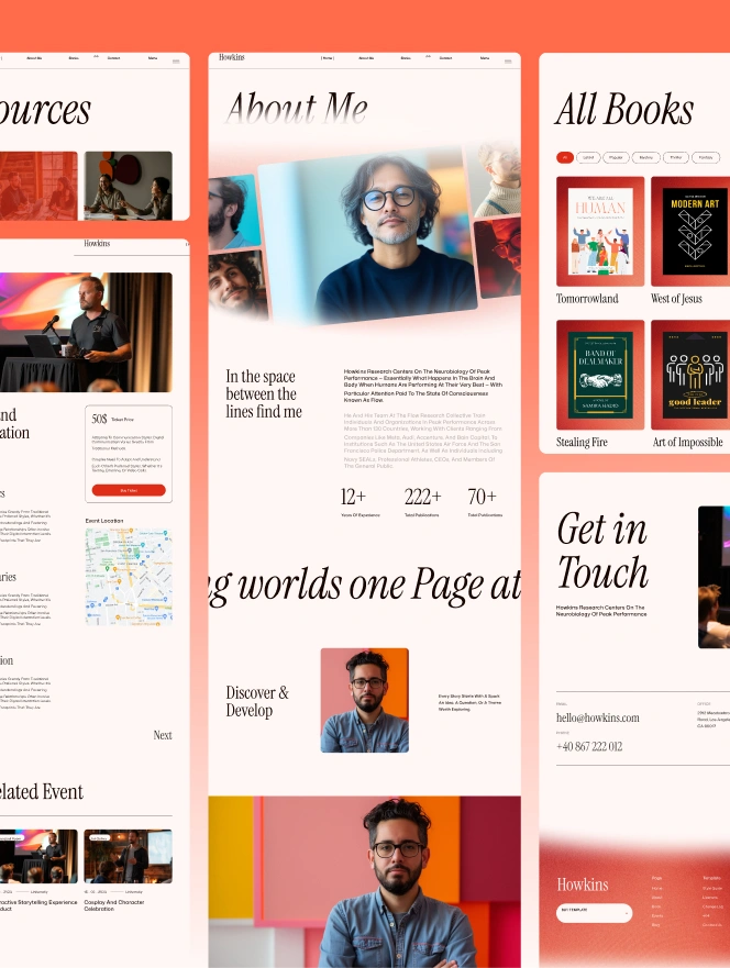
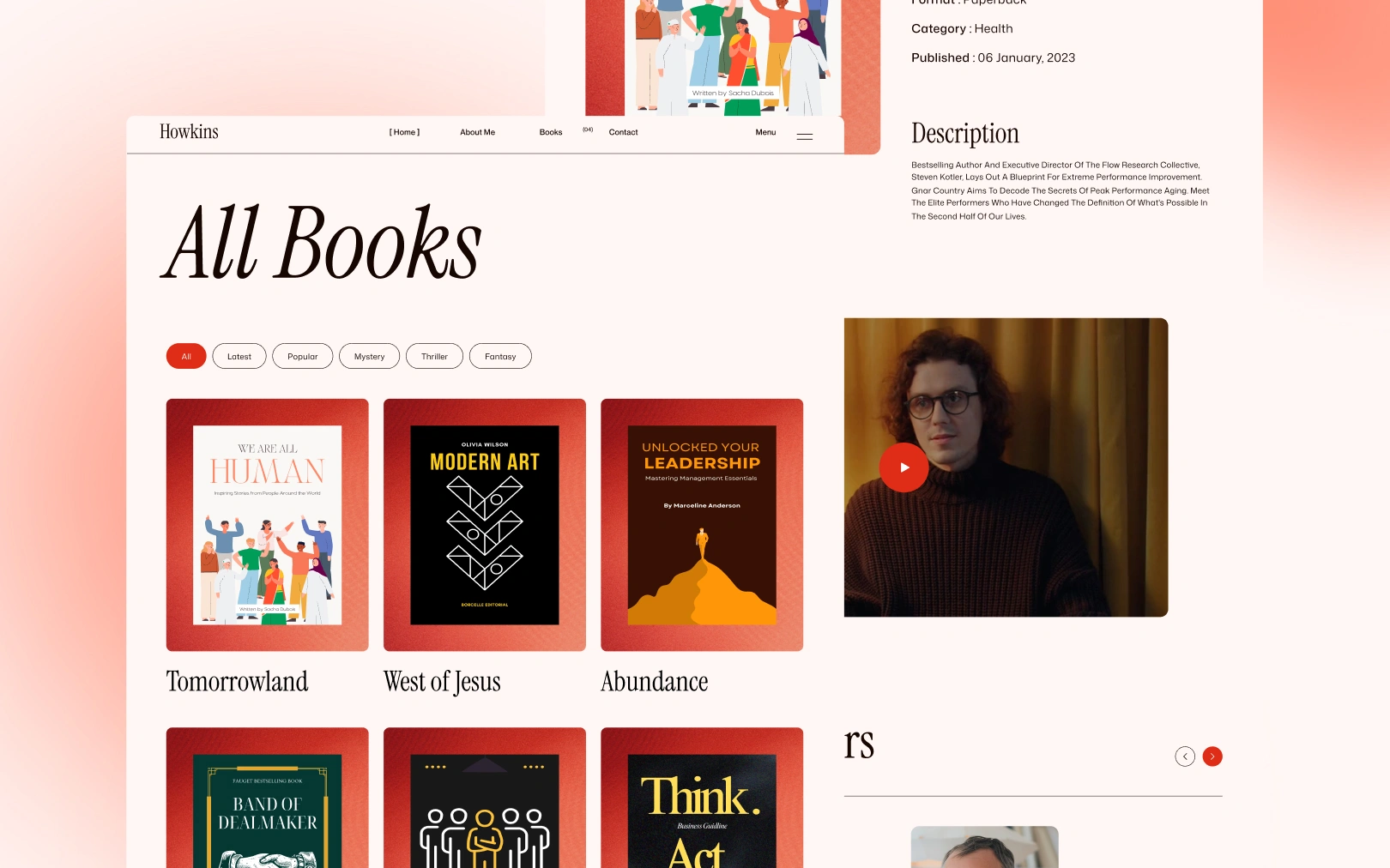
Editorial literary warmth, a serif-driven author brand pairing Instrument Serif gravitas with a terracotta accent on warm cream paper.
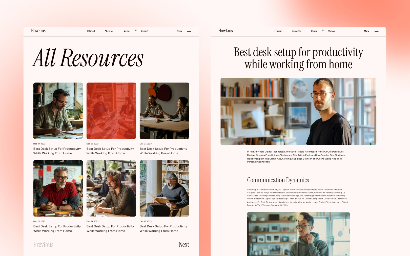
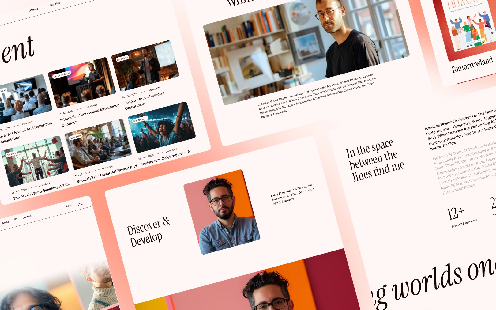
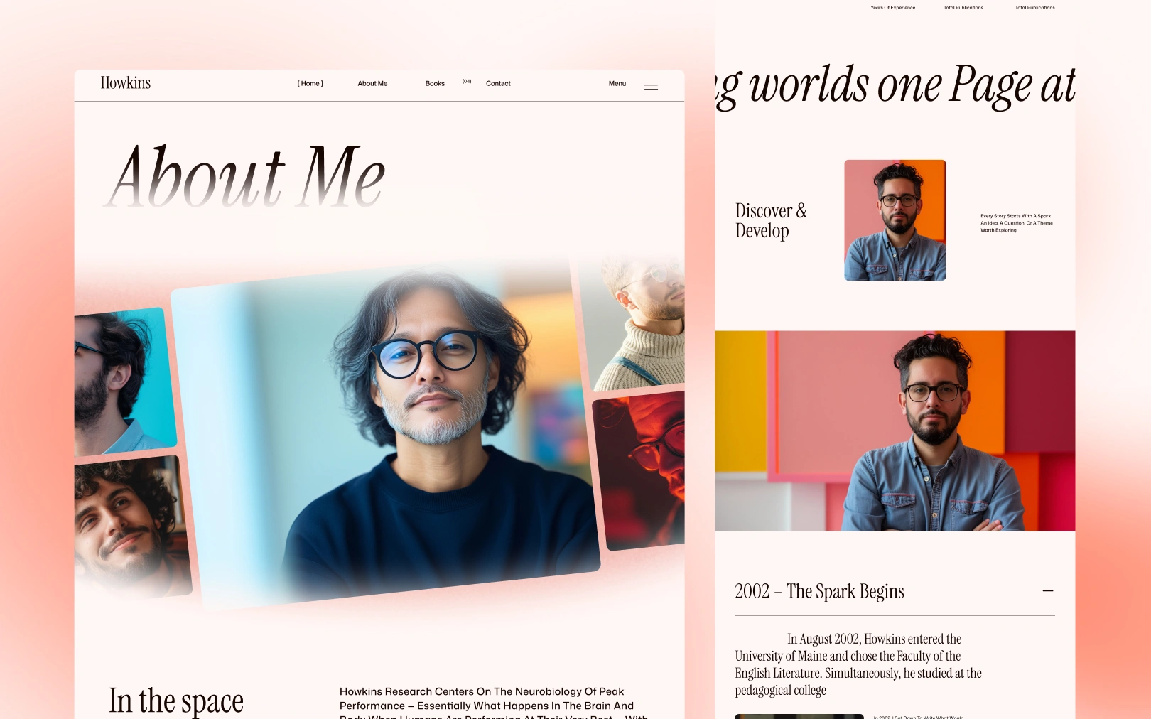
Overview
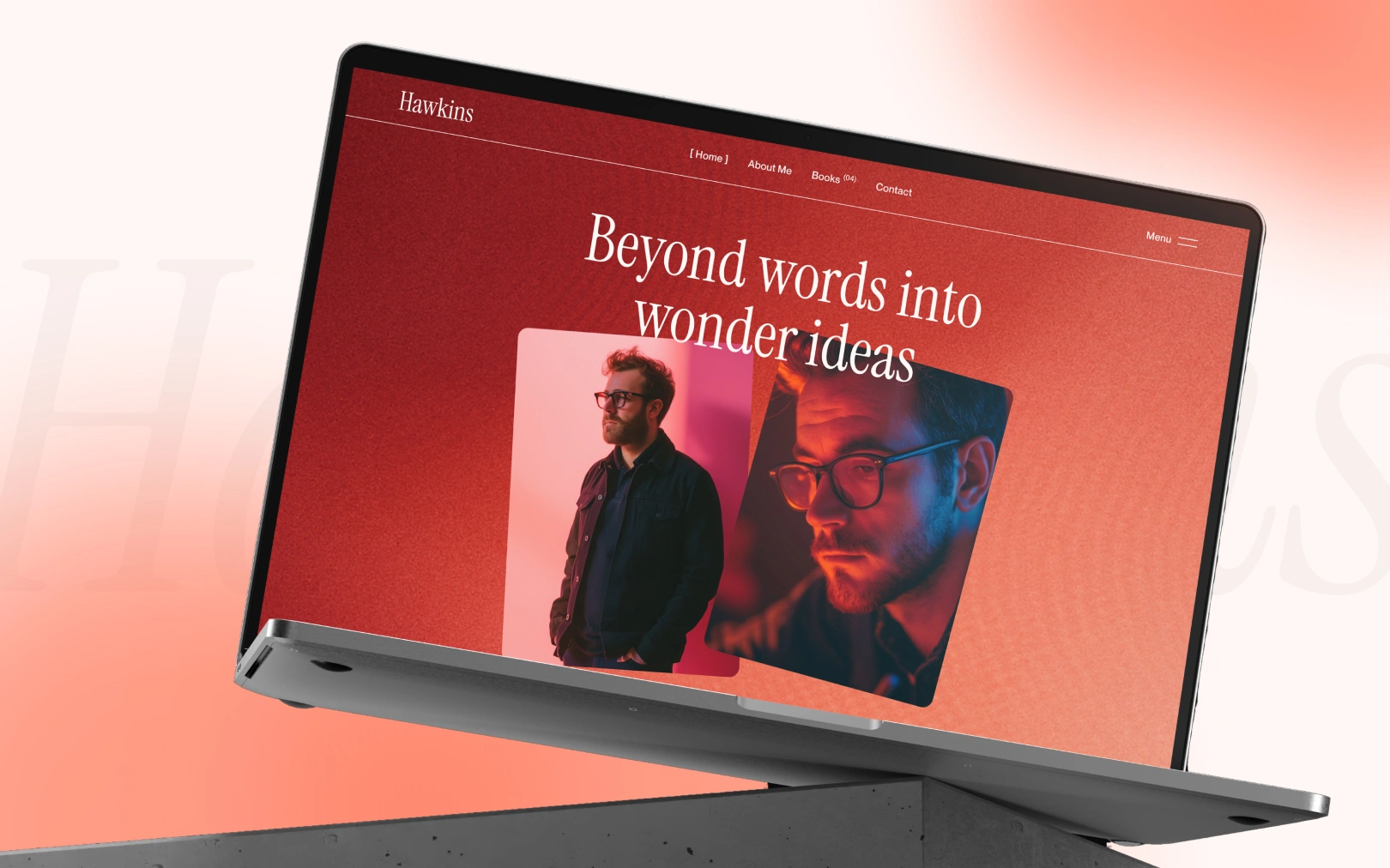
Howkins is a visual identity built for a New York Times-bestselling author. The design pairs Instrument Serif — an elegant, high-contrast display serif — with Mona Sans for utility and body text. The result feels literary, editorial, and warm without being stuffy.
The dominant surface is a warm cream (#FFF7F5) that reads as aged paper,
punctuated by a saturated terracotta accent (#CE2D19) used sparingly to
drive interaction. Dark sections use a deep charcoal-blue (#161019) rather
than pure black, preserving the warm undertone that ties the palette together.
The overall mood is cinematic and curated — closer to a book-jacket spread than a SaaS product page.
Colors
Typography
h1
h2
h3
body-lg
body-md
label-caps
Spacing
Rounded & Borders
Components
button primary
button primary hover
nav link
nav link on light
card
card image
avatar
section dark
Do's & Don'ts
- Do use Instrument Serif only for headings (h1–h3). It is not designed for body-length text — its high contrast fatigues at small sizes.
- Do maintain the warm undertone across all surfaces. The cream, the near-black, and the terracotta all share a red/warm bias. Pure white, pure black, or cool grays will break the palette.
- Do use generous section padding (60–140px). The editorial mood depends on content that breathes — tight spacing will make it feel like a SaaS landing page.
- Don't add box shadows for depth. This design achieves separation through background-color contrast between alternating cream and dark sections, not elevation.
- Don't use the terracotta (
tertiary) for large surface fills outside the hero. It is an accent — overuse kills its signal as the interaction driver. - Don't use all-caps for labels. The source uses
capitalize(first letter only), which is softer and more editorial thanuppercase. - Don't introduce a second font family. The Instrument Serif + Mona Sans pairing IS the brand. Adding a third dilutes it.

Join the New Era of Web Creators

Product


Our Brand




© 2026 Pagifye. All rights reserved.