Castify
Dark-mode podcast platform, warm plum-black canvas, hot-pink gradient CTAs, editorial Poppins headlines over Inter body.
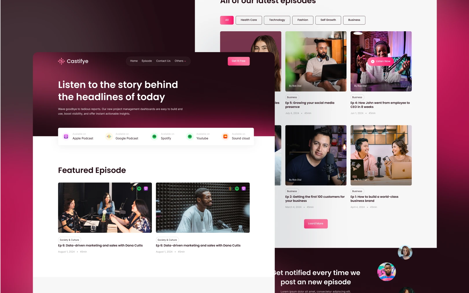
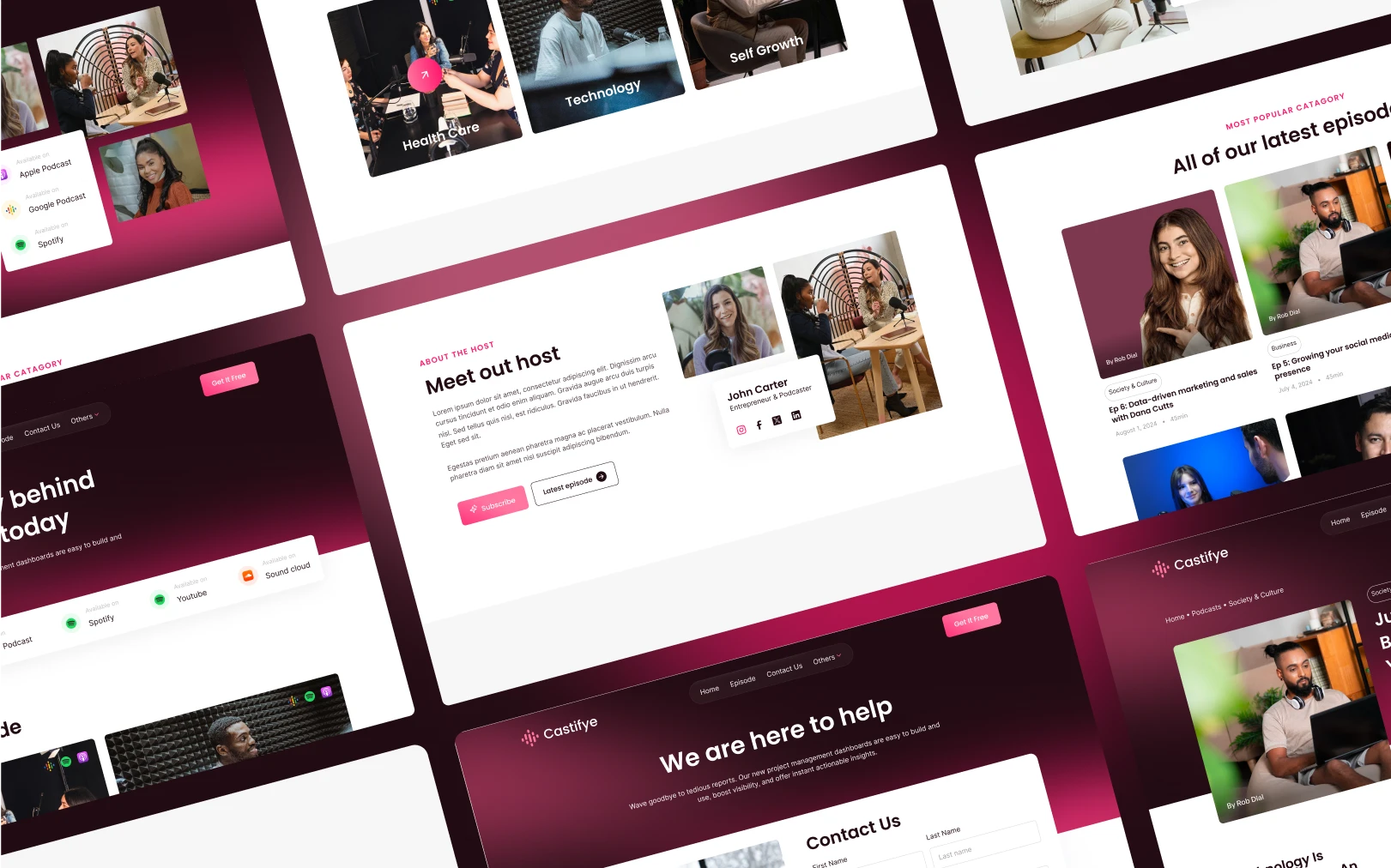
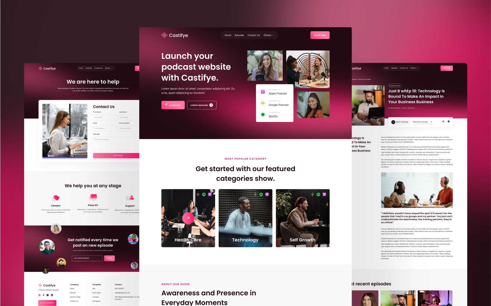
Overview
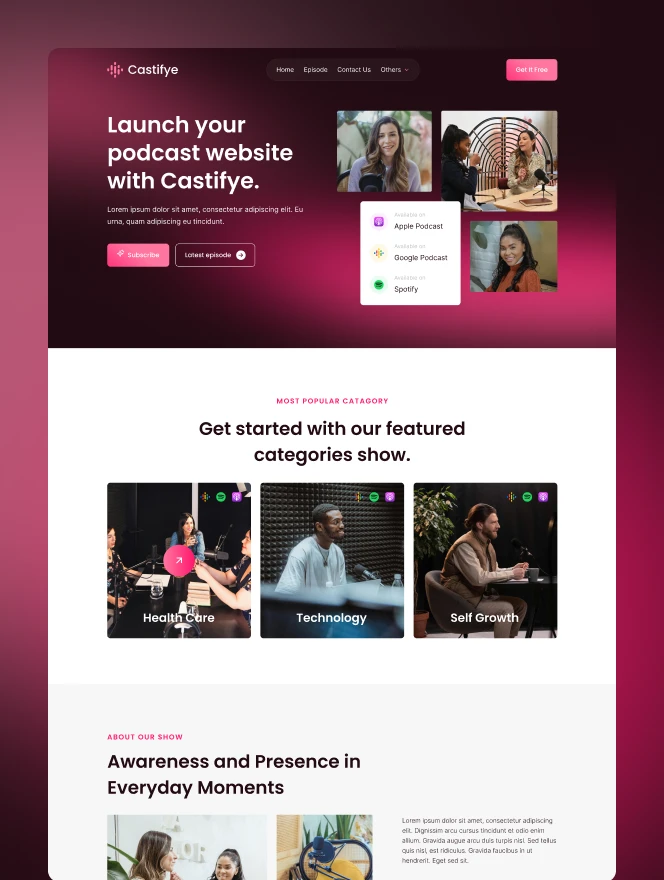
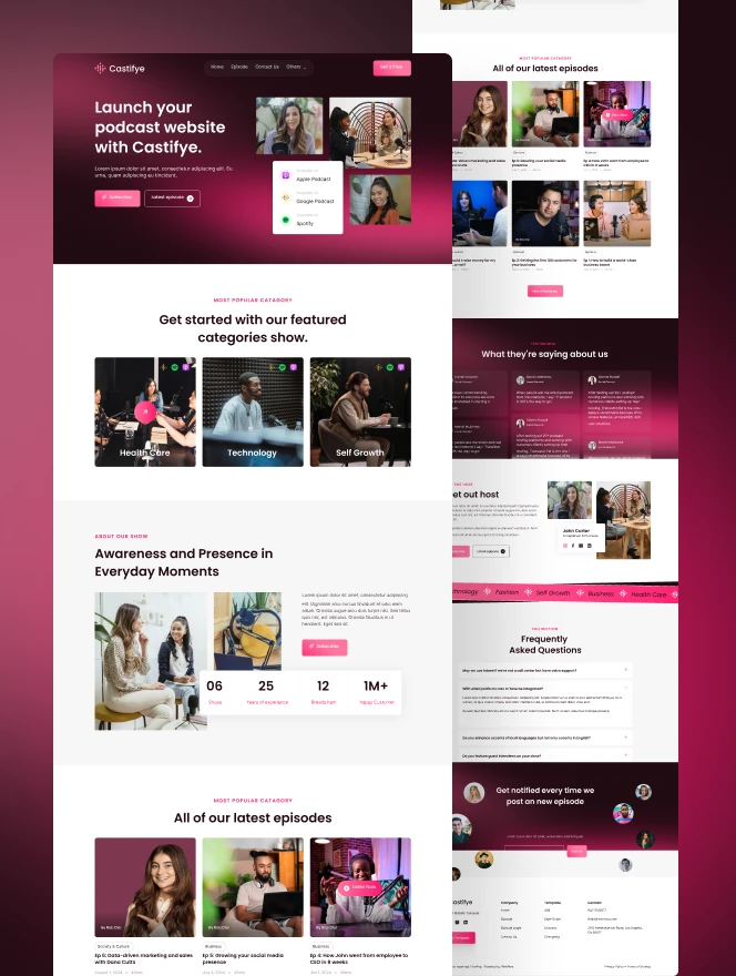
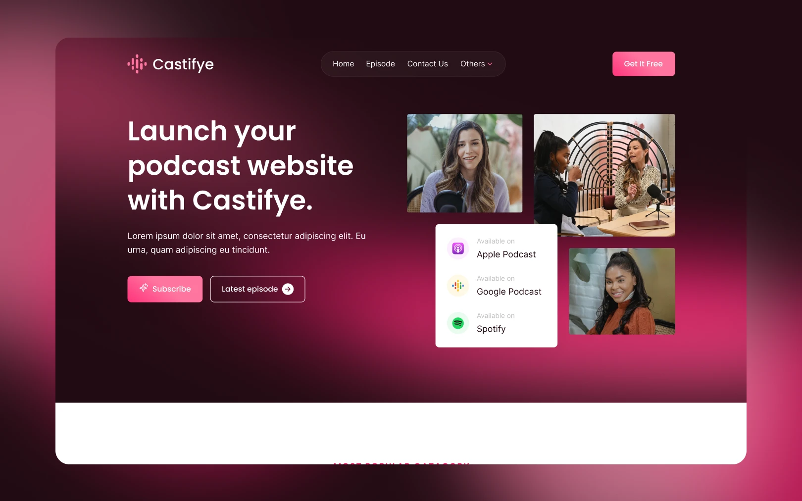
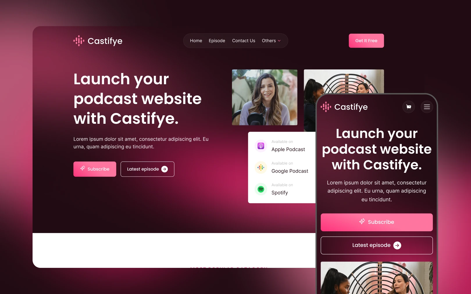
Castify is a podcast-platform template built on a warm plum-black canvas
(#220B13) punctuated by a hot-pink gradient — the sole interaction driver.
The visual mood is premium audio editorial: immersive dark sections alternate
with airy white gallery sections, warm lifestyle photography of podcast studios,
and a scrolling category marquee. Poppins carries every headline and label with
geometric confidence; Inter handles body text with workhorse neutrality. The
pink accent is used sparingly — eyebrows, stat labels, and CTAs — so it never
loses signal. The overall feeling is modern, media-savvy, and intimate, like a
late-night radio studio with the lights dimmed.
Colors
Typography
h1
h2
h3
stat
body-lg
body-md
button
eyebrow
badge
Spacing
Rounded & Borders
Shadows & Elevation
The system avoids heavy drop shadows. Instead, depth comes from:
- Glassmorphic overlays — testimonial cards use
rgba(255,255,255,0.05)fill with a 10% white border, creating a frosted-glass effect on dark. - Z-layered imagery — hero and about-show sections overlap images at different scales and positions rather than using shadow elevation.
- Border outlines — secondary and tertiary buttons rely on 1px borders (white on dark, dark on light) instead of fills for low-emphasis actions.
No box-shadow tokens are defined; if needed in implementation, use a subtle
0 4px 24px rgba(0,0,0,0.08) on light sections only.
Components
button primary
button primary hover
button secondary
button tertiary
card testimonial
input field
badge category
Do's & Don'ts
- Do use the pink accent (
{colors.tertiary}) only for eyebrows, stat labels, and primary CTAs. It earns its impact through restraint. - Do alternate dark and light sections to create the immersive rhythm that defines the Castify feel.
- Do apply the 218-degree gradient to primary buttons, not a flat pink fill.
- Don't introduce shadows on dark sections — use glassmorphic overlays
(
rgba(255,255,255,0.05)+ border) for depth. - Don't use Poppins for body text — it's reserved for headlines, stats, and uppercase eyebrows. Inter handles all running text.
- Don't round image corners beyond 4px — the system's geometric crop aesthetic depends on near-square images.
- Don't nest component variants.
button-primary-hoveris a sibling key, not a child ofbutton-primary.
Join the New Era of Web Creators

Product


Our Brand




© 2026 Pagifye. All rights reserved.