Sprring
Editorial serif meets calm sage, a modern jewelry commerce identity built on organic tones, generous whitespace, and architectural restraint.
Overview
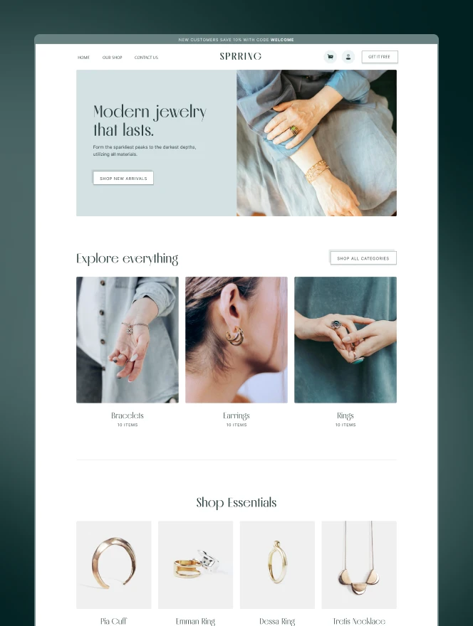
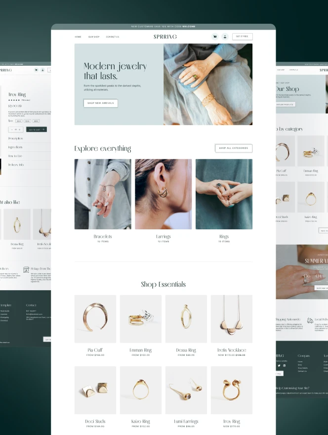
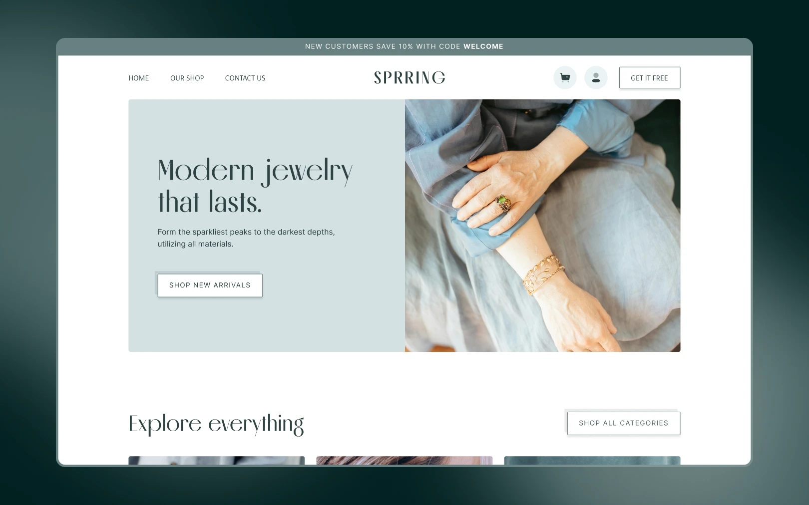
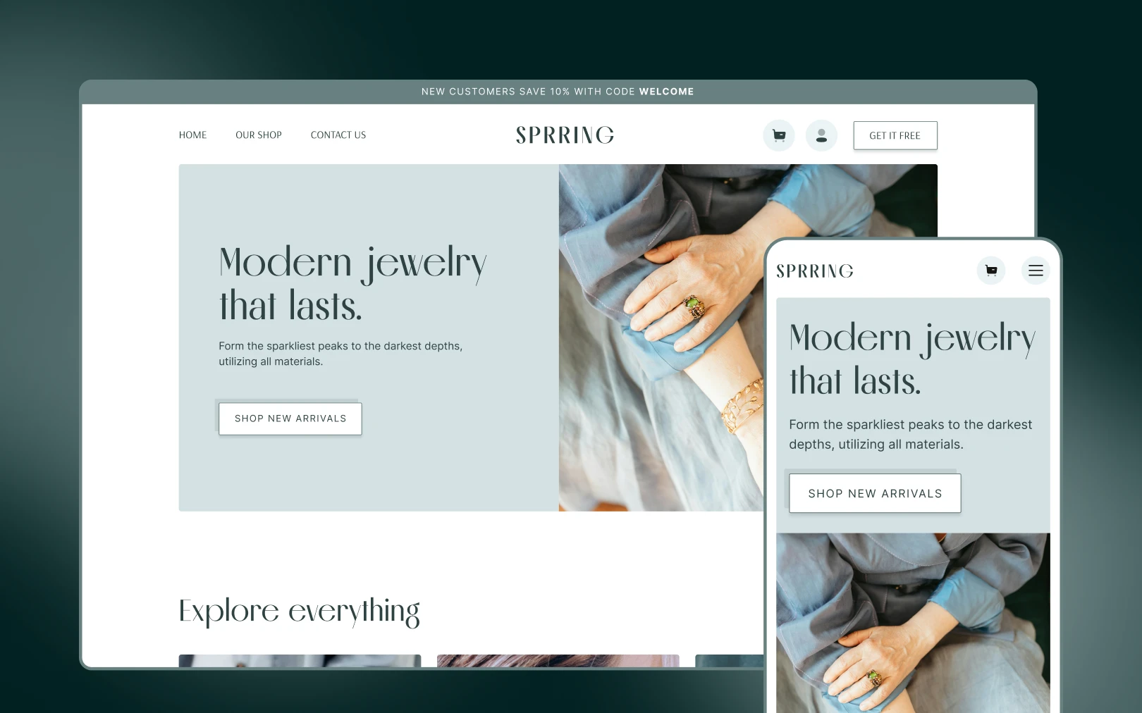
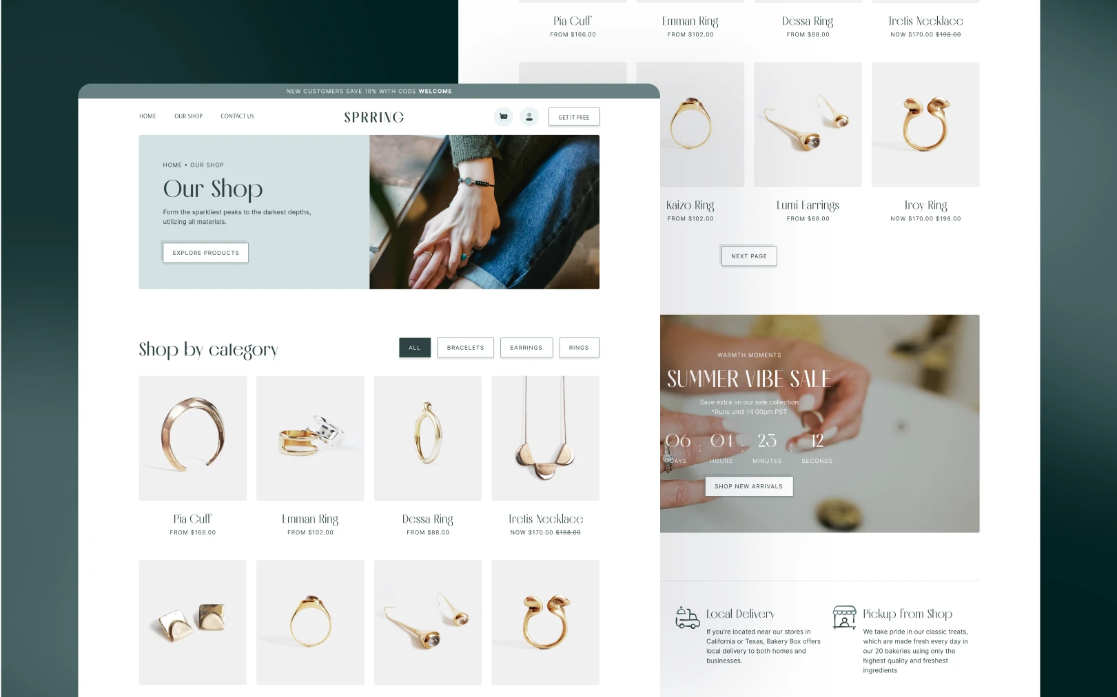
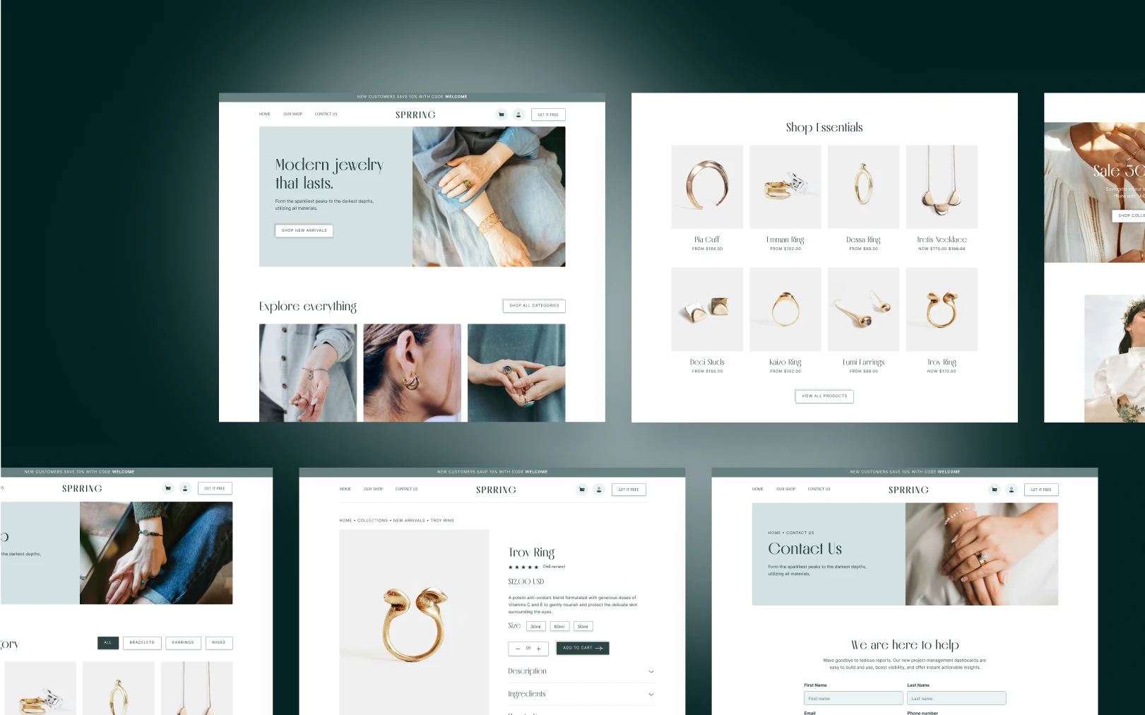
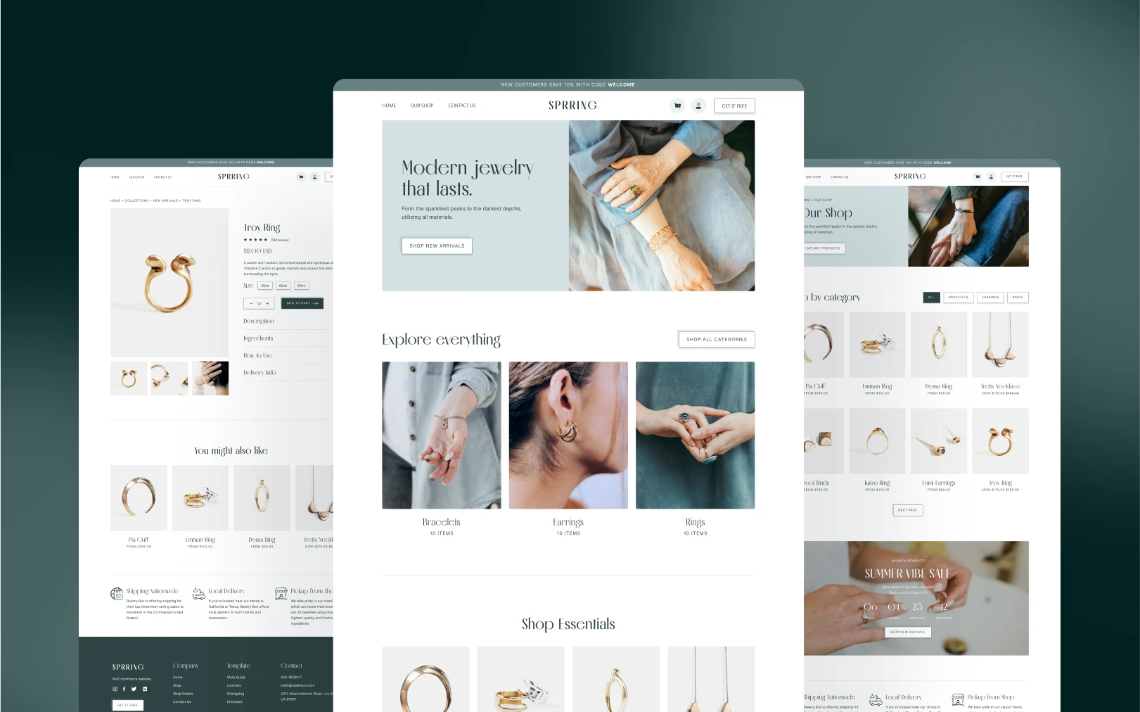
Sprring is a modern jewelry commerce identity that pairs editorial serif headlines (Melodrama) with a calm, organic sage palette. The visual register sits between fashion-magazine editorial and quiet architectural minimalism — think Aesop meets Mejuri, filtered through a Scandinavian sensibility.
The brand's emotional goal is quiet confidence. The sage-on-white palette reads as natural and unhurried; the high-contrast serif headlines add gravitas without shouting. There is no neon accent, no gradient, no drop shadow. Hierarchy comes entirely from type scale, surface color shifts, and generous whitespace.
Colors
Typography
h1
h2
h3
body-md
body-sm
label-caps
Spacing
Rounded & Borders
Shadows & Elevation
Flat by default. No shadows. The template uses zero box-shadow
declarations. Depth is created entirely through:
- Background color shifts (surface tiers, see Colors)
- Border lines (1px solid
secondaryon outline buttons) - Whitespace separation between sections
Do not introduce drop shadows, card lift effects, or gradient overlays. The flatness is intentional — it keeps the palette doing all the work.
Components
button primary
button primary hover
button outline
button outline hover
button ghost
button ghost hover
card
card tinted
badge pill
Do's & Don'ts
- Do keep all interaction chroma within the sage palette. There is no secondary accent hue — if you need emphasis, use surface tier shifts.
- Do use Melodrama only for headings and Inter only for body/utility. Never mix them within the same text block.
- Do use the eyebrow label pattern (Inter 14px, uppercase, 0.1em tracking) above section headings to establish editorial rhythm.
- Do keep product and category cards at 0px radius — the sharp framing is a core brand signal.
- Don't introduce drop shadows, card lift effects, or gradients. The design is intentionally flat.
- Don't nest button variants.
button-primary-hoveris a sibling key, not a child ofbutton-primary. - Don't place more than one
button-primaryper viewport. It loses its signal if repeated. - Don't add colors outside the five-stop palette. Extend the palette first, then reference the new token.

Join the New Era of Web Creators

Product


Our Brand




© 2026 Pagifye. All rights reserved.