Meetzen
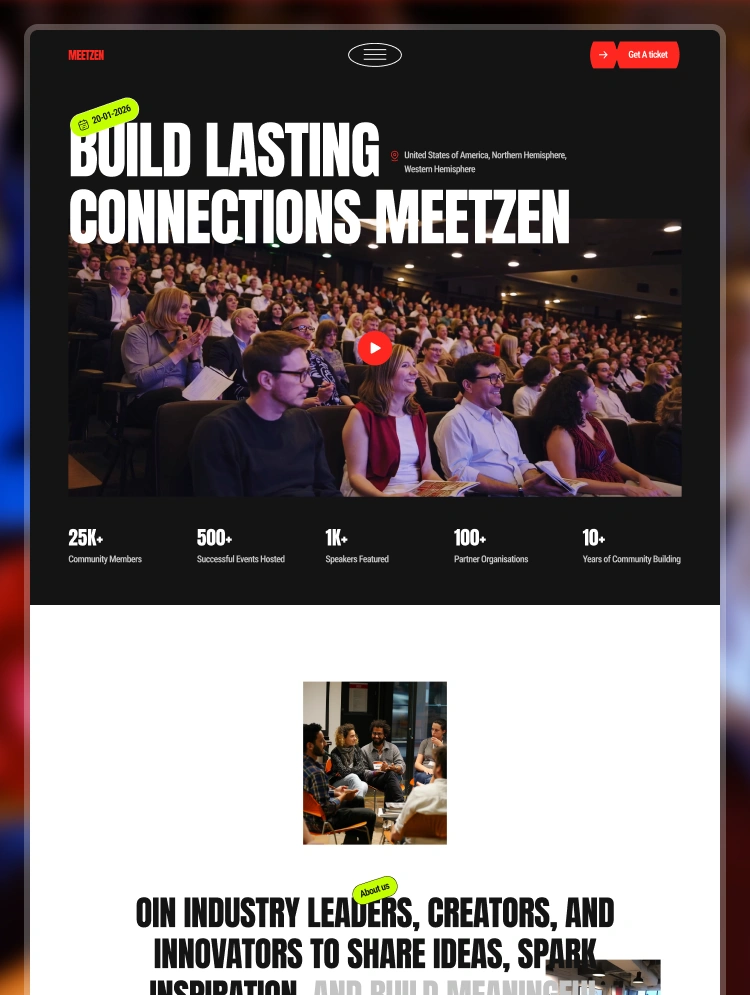
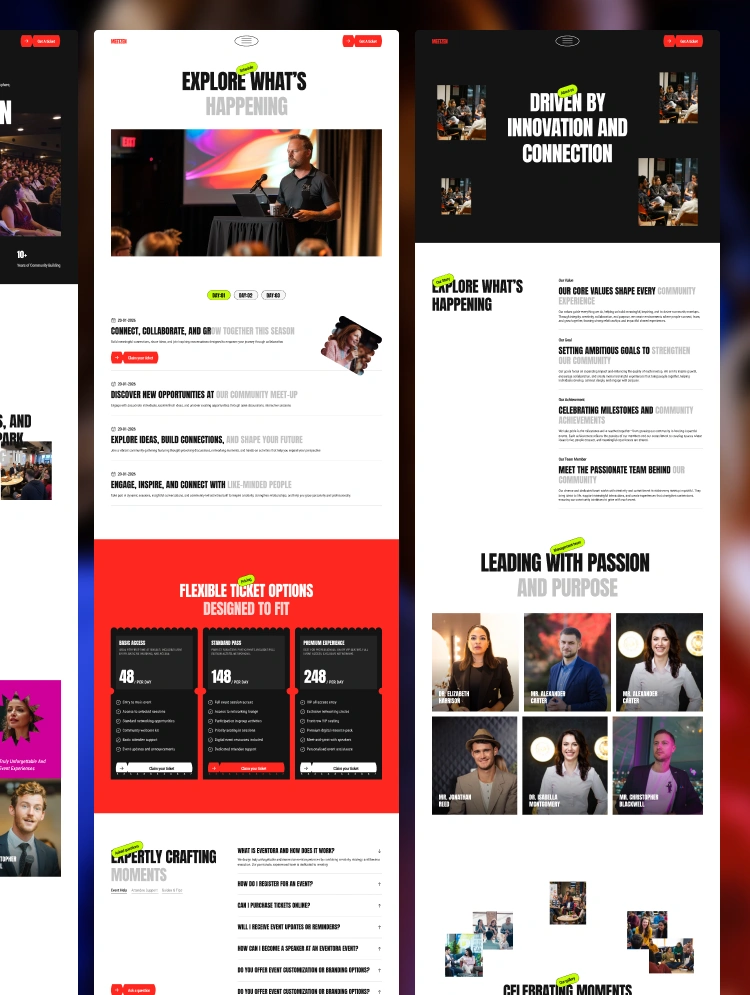
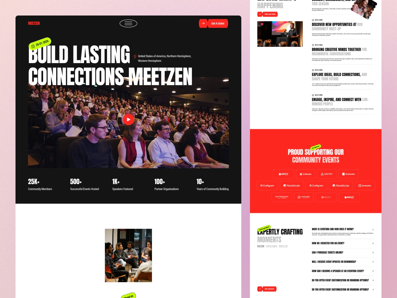
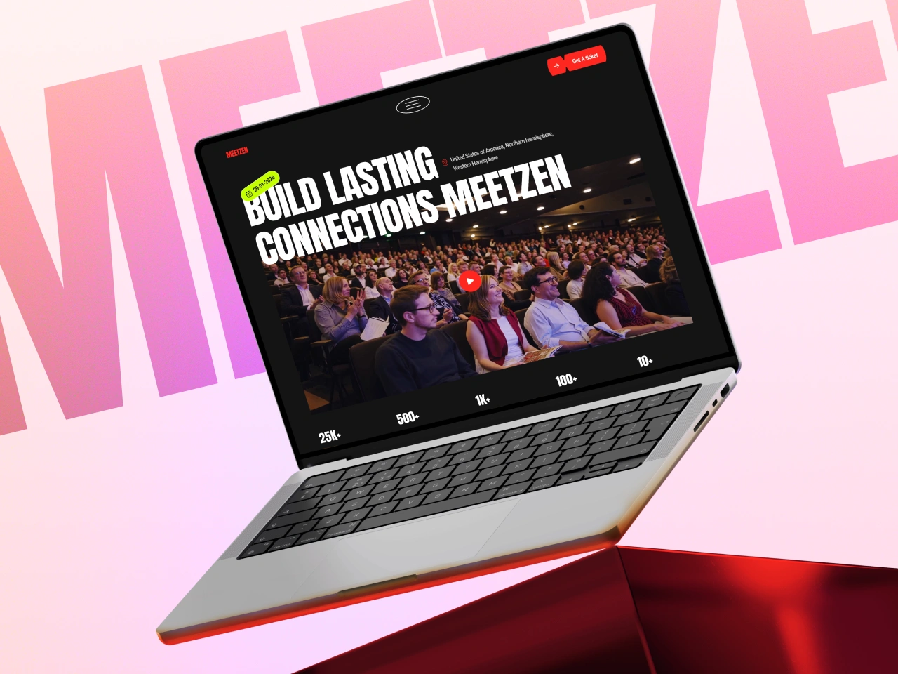
A modern community meet-up event template built for concerts, networking events, and workshops. featuring a registration-focused design to showcase speakers, schedules, and drive ticket sales effortlessly.
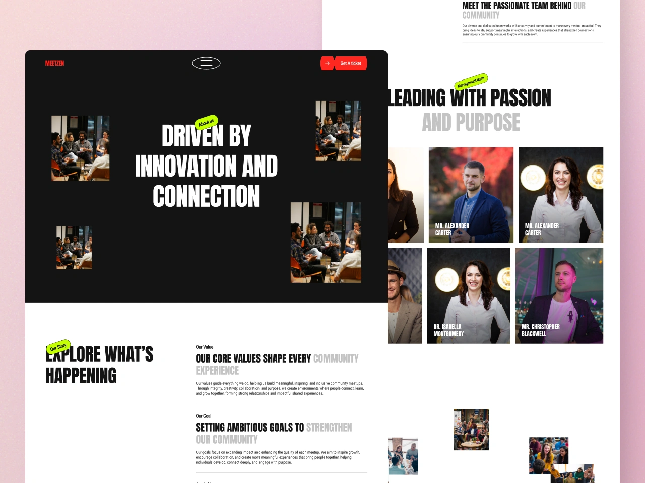
Overview
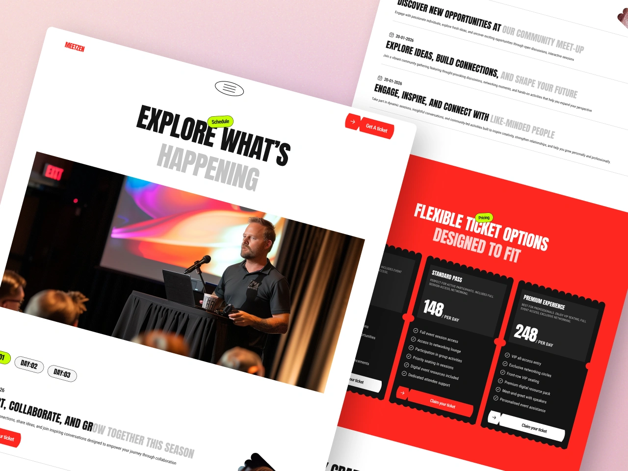
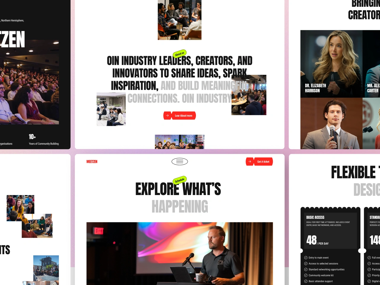
Meetzen is a conference and events brand built around poster-grade visual impact. The identity borrows from editorial design and street-poster typography: ultra-condensed display headlines set in Anton, paired with Roboto Condensed for everything else. The page alternates between brilliant white space and full-bleed color blocks — signal red and deep ink — creating a rhythm that feels like flipping through a printed event programme.
The mood is energetic, urgent, and communal. Red is not a subtle accent; it floods entire sections (pricing, sponsors) to signal "this is where the action is." Headlines shout in uppercase. Images are sharp-cornered. Buttons are full pills. The tension between sharp geometry (images, cards) and soft geometry (pill buttons, organic decorative SVG shapes behind speaker photos) gives the brand its signature energy.
Colors
Typography
h1
h2
h3
body-lg
body-md
body-sm
label-md
label-sm
Spacing
Rounded & Borders
Components
button primary
button primary hover
button secondary
dark section
red section
pricing card
pricing card featured
pricing card number
body copy muted
secondary text
gallery image
footer
Do's & Don'ts
- Do maintain the light-dark-red-dark color-blocking rhythm. It is the structural backbone of every page, not a decorative choice.
- Do keep typography to Anton + Roboto Condensed. The two-font system is load-bearing — introducing a third family dilutes the poster aesthetic.
- Do uppercase all Anton headings. Mixed-case Anton loses the condensed impact that defines the brand voice.
- Don't use intermediate border-radius values (4px, 8px, 12px, 16px). The design is binary: sharp (0px) for content surfaces, pill (9999px) for interactive elements. No exceptions.
- Don't apply signal red (
#E70700) to small UI elements or thin strokes. Red is a flood color — it commands full sections and solid button fills. Using it for borders, icons, or text links weakens its signal. - Don't lighten the ink (
#141414) to create grey sections. If you need a darker-than-white but lighter-than-ink surface, usemuted-light(#C4C4C4) at low opacity or introduce a new token — don't interpolate between existing ones. - Don't nest component variants.
button-primary-hoveris a sibling entry, not a child property.
Join the New Era of Web Creators

Product


Our Brand




© 2026 Pagifye. All rights reserved.