Medifye
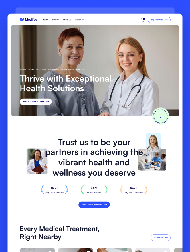
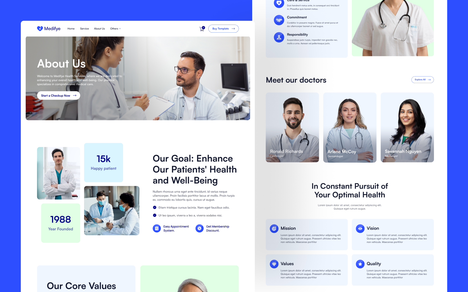
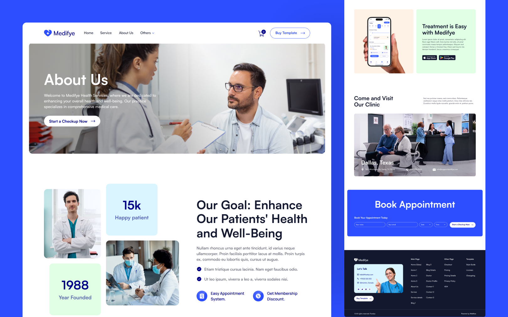
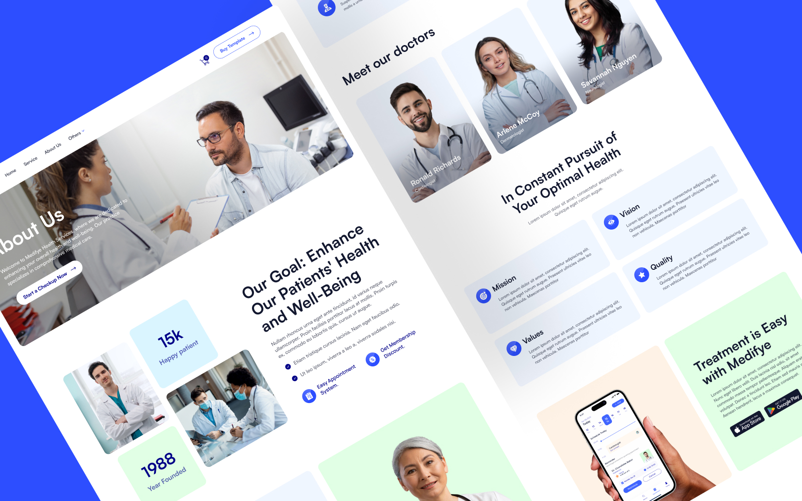
A clean, trust-forward medical services identity, Satoshi sans-serif, white canvas, blue accents, rounded imagery, and warm secondary tints that signal care without clinical coldness.
Overview
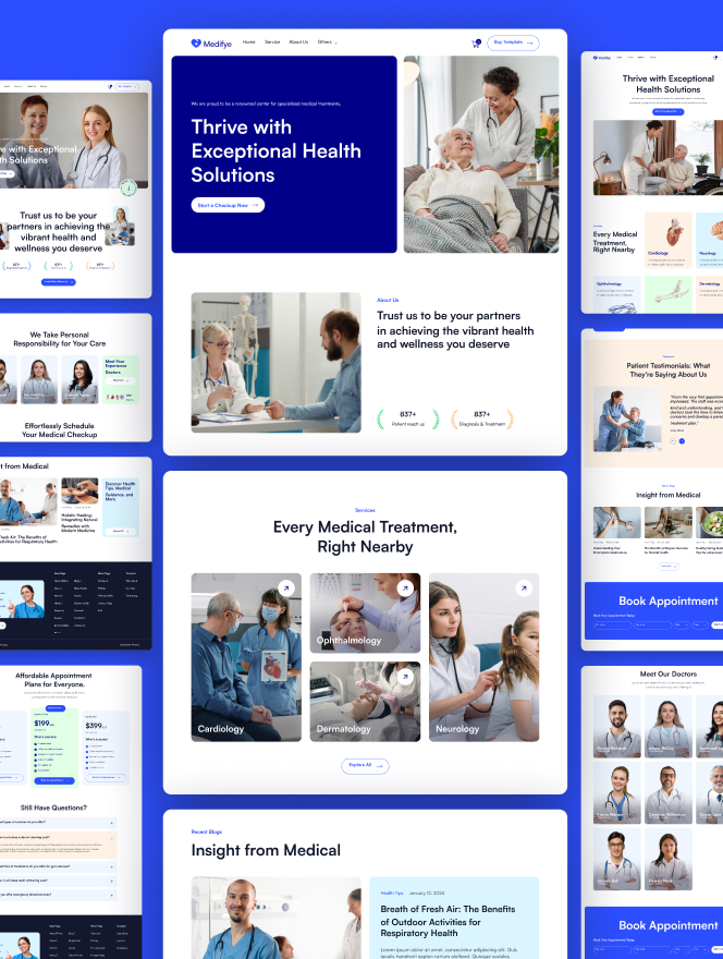
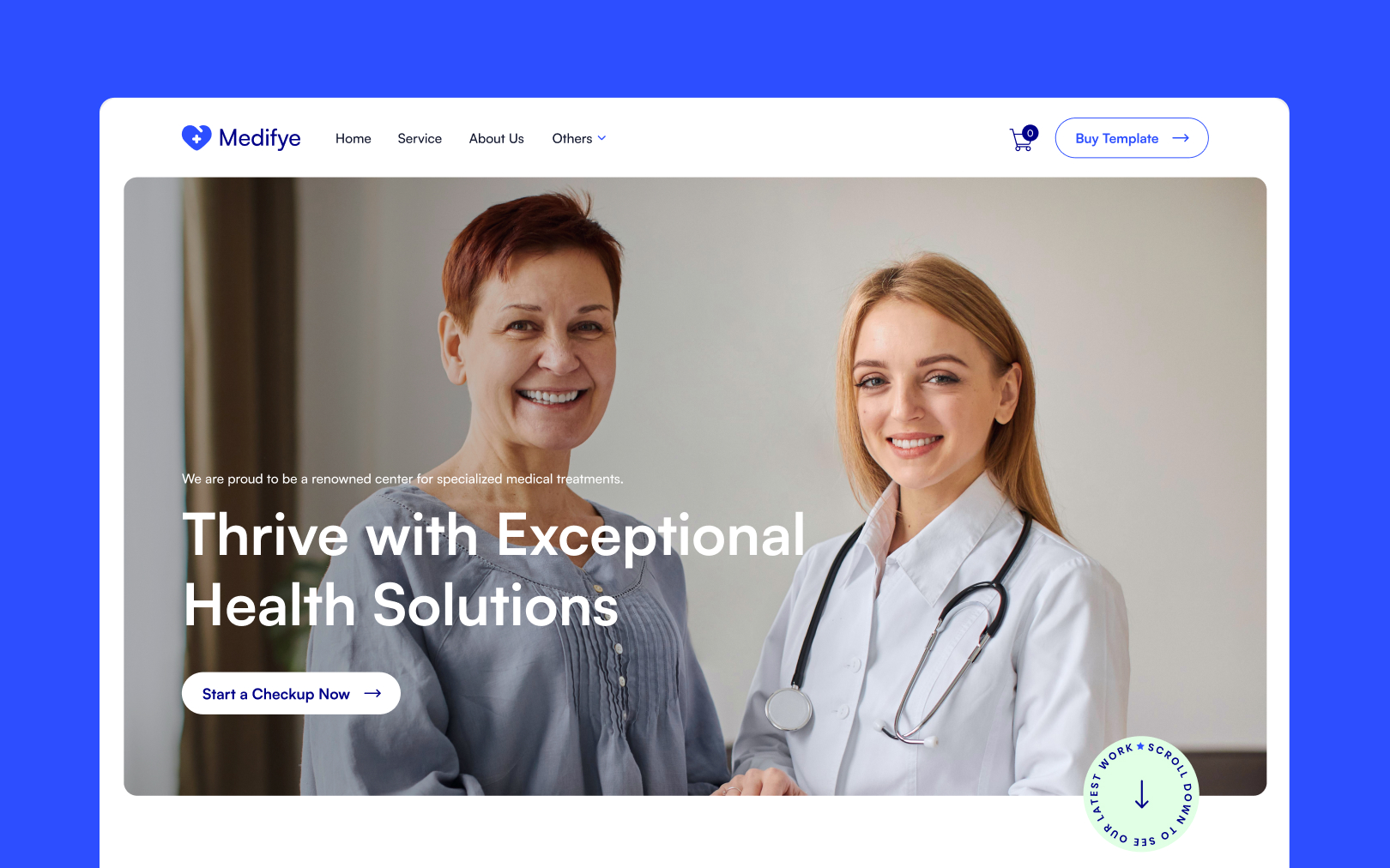
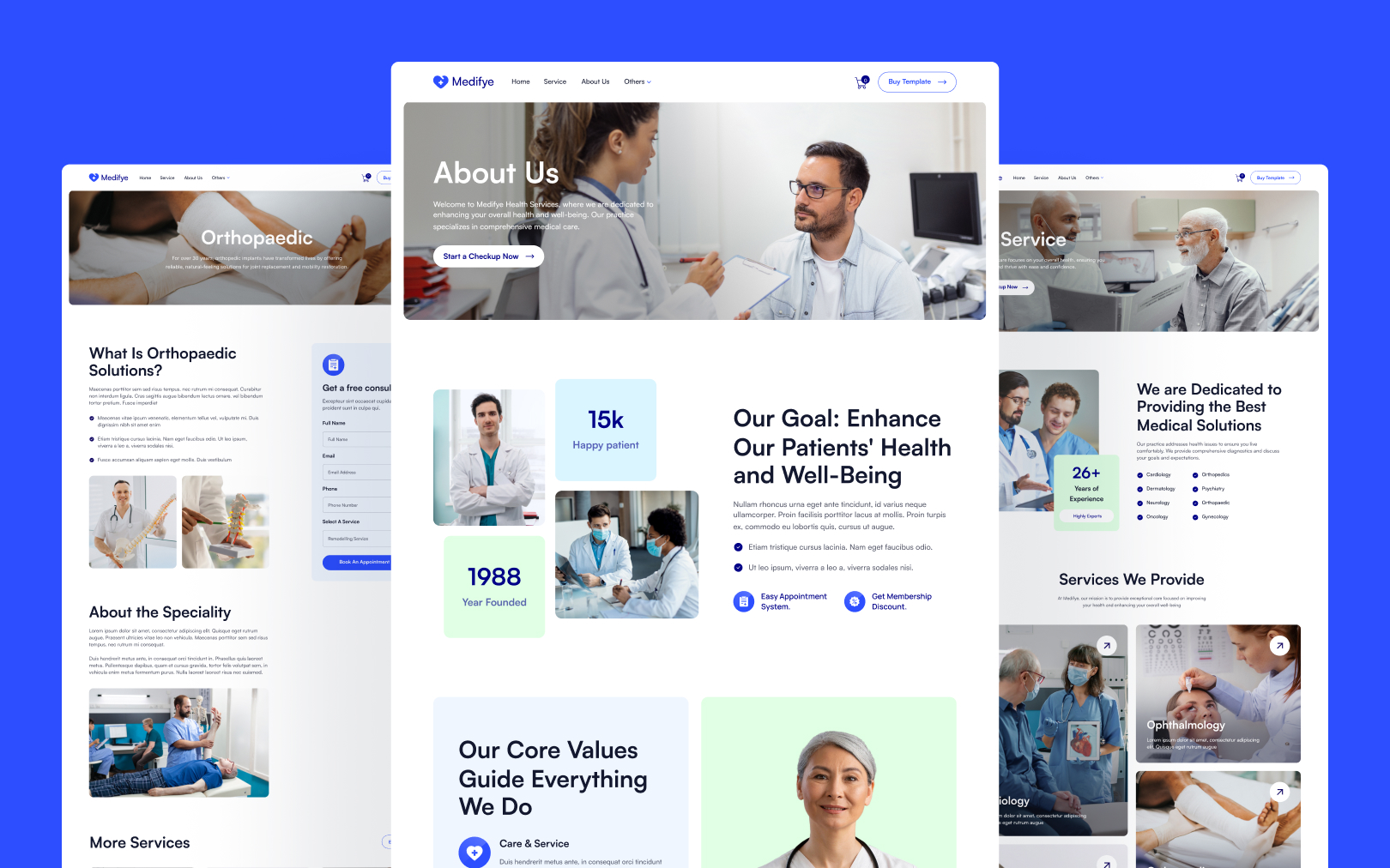
Medifye is a medical services website template designed to communicate trust, clarity, and warmth. Its visual language pairs the geometric neutrality of Satoshi sans-serif with a cobalt-blue primary accent against a near-black ink and white canvas. The result reads as clinical-but-approachable — the kind of identity suited to a multi-specialty clinic, telehealth platform, or healthcare network that wants to feel modern without losing gravitas.
The design relies on three structural habits: (1) generous vertical rhythm at the section level (80–140px padding), (2) pill-shaped buttons and badges as the dominant interactive shape, and (3) large rounded-corner imagery (16px radius) that softens the clinical edge. Secondary tint backgrounds (pale blue #DAF5FF, pale mint, pale cream) are used to differentiate sections without introducing heavy color blocks.
Colors
Typography
display-xxl
h1
h2
h3
h4
h5
h6
body-lg
body-md
body-sm
Spacing
Rounded & Borders
Components
button primary
button primary hover
button secondary
button secondary hover
card service
card testimonial
badge pill
form input
form input focus
state success
state error
text meta
footer
Do's & Don'ts
Do's
- Use the blue primary (#2C4EFF) as the sole interaction color. Buttons, links, active nav states, and focus rings should all share it. This consistency is what makes the template feel coherent.
- Keep buttons fully pill-shaped (99px radius). This is the signature interactive shape — mixing in rectangular buttons breaks the visual language.
- Pair large imagery with 16px rounded corners. Medical photography benefits from softening; hard corners read as clinical/cold.
- Maintain the 100px+ section padding on desktop. The generous vertical rhythm is what prevents the dense medical content from feeling cramped.
- Use the pale tints (neutral, blue-light) for section breaks instead of heavy color blocks or borders. They differentiate without adding visual noise.
- Load Satoshi with 400, 500, and 700 weights. The 500 weight is used for button text specifically.
Don'ts
- Don't use the orange (#FF6314) as a primary interaction color. Despite its legacy "Background Primary" label in the style guide, the rendered site uses blue for all primary actions. Reserve orange for rare warm accents.
- Don't apply letter-spacing/tracking to headings or buttons. The template deliberately uses
normaltracking throughout. - Don't introduce all-caps text labels. Every label, badge, and button in the template uses sentence case.
- Don't use hard borders on cards. Separation is achieved through background tint and radius, not 1px borders. Form inputs are the exception (translucent border).
- Don't round buttons to anything less than full pill. An 8px or 16px radius on a button will look wrong next to the established pill pattern.
- Don't use pure black (#000000) for text. The template's ink color is
#0D0E13— slightly cooler and softer than pure black. Pure black creates harsher contrast against the blue primary.
Join the New Era of Web Creators

Product


Our Brand




© 2026 Pagifye. All rights reserved.