Homeifye
Premium real estate platform, warm minimalism pairing deep forest green with vibrant orange, built on Urbanist typography.
Overview
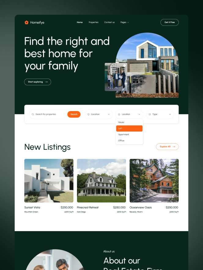
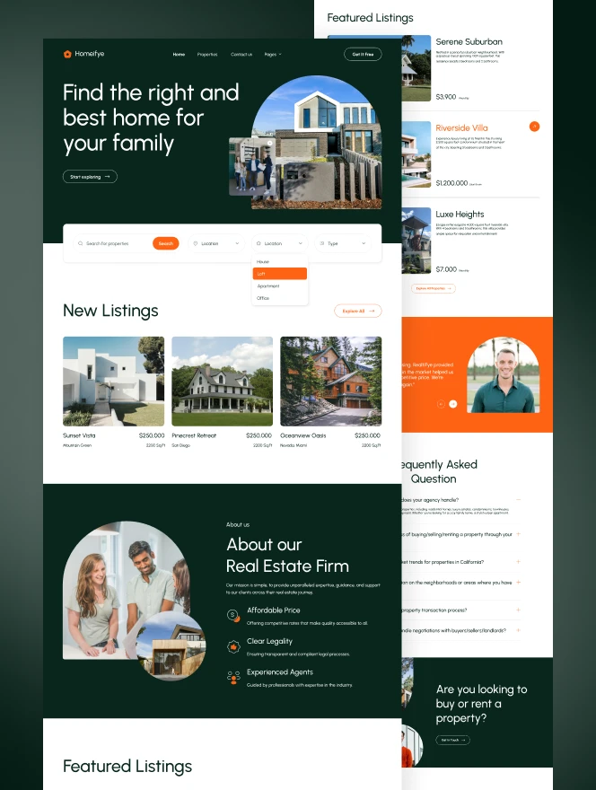
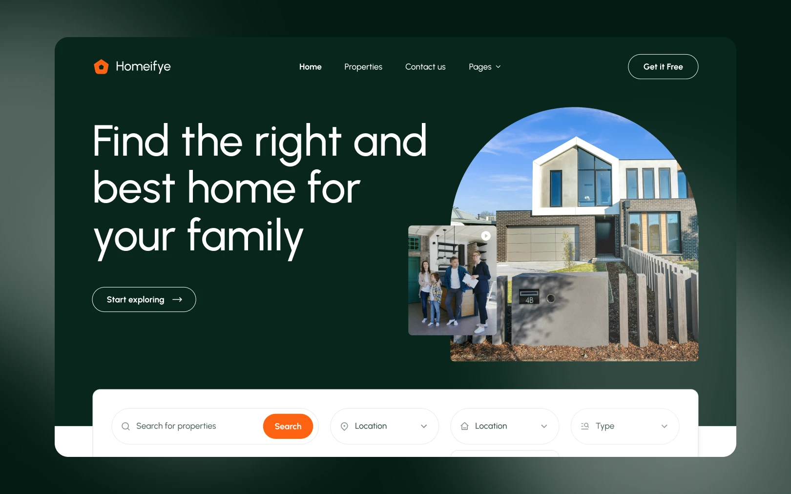
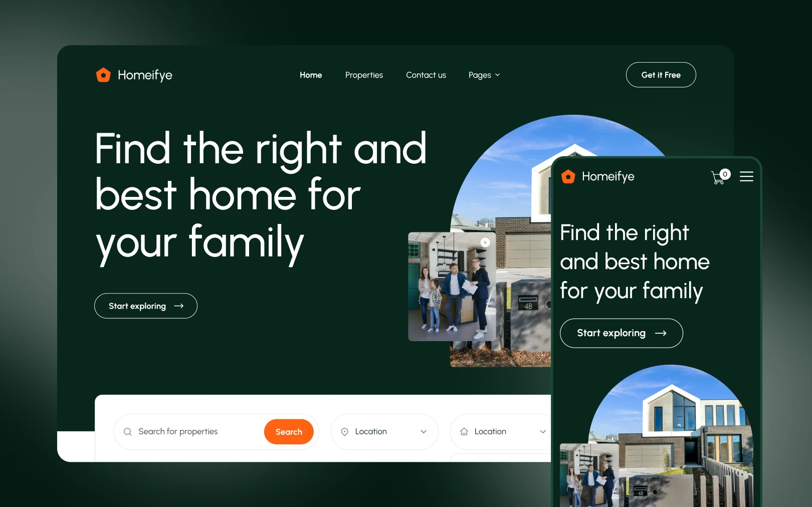
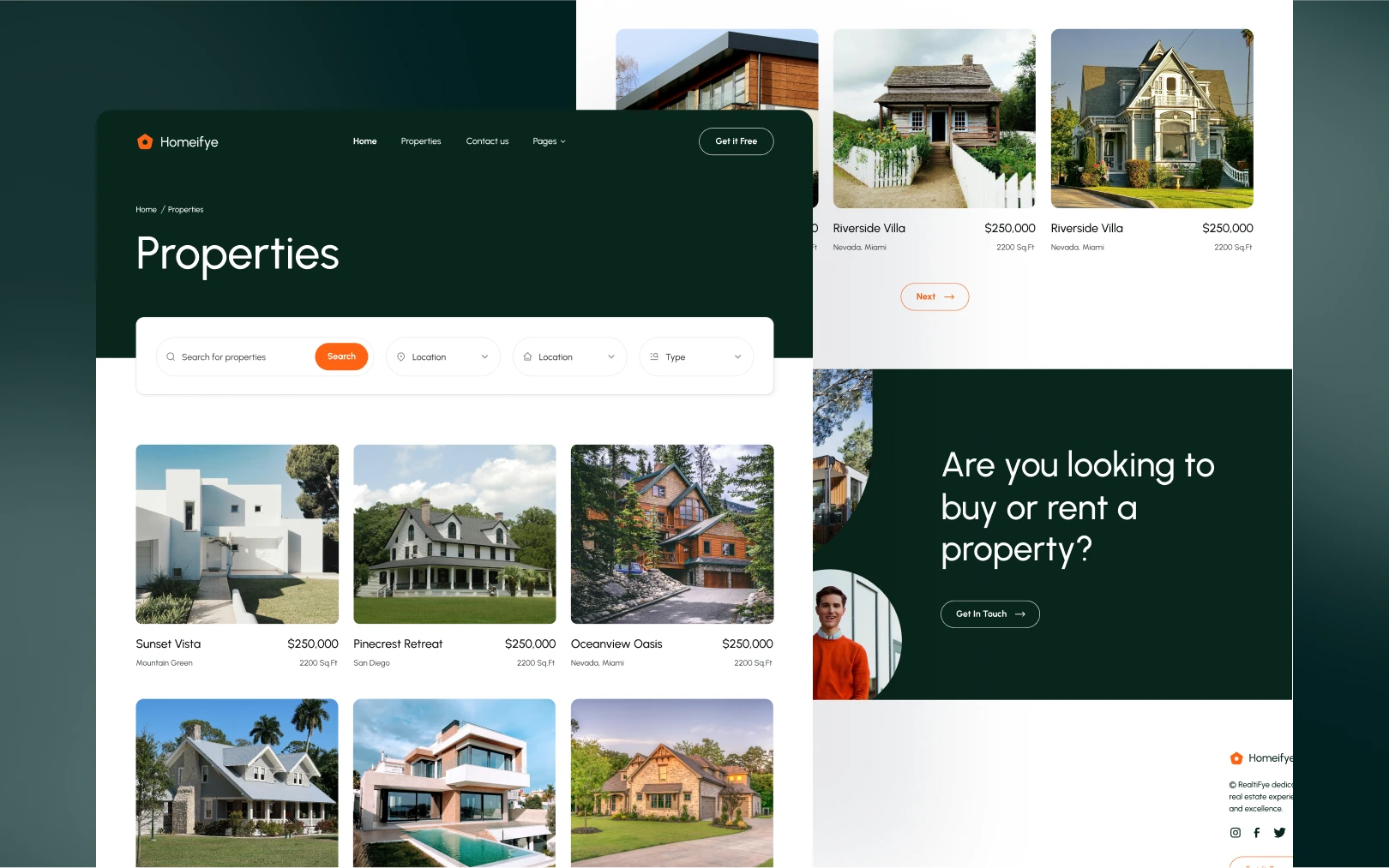
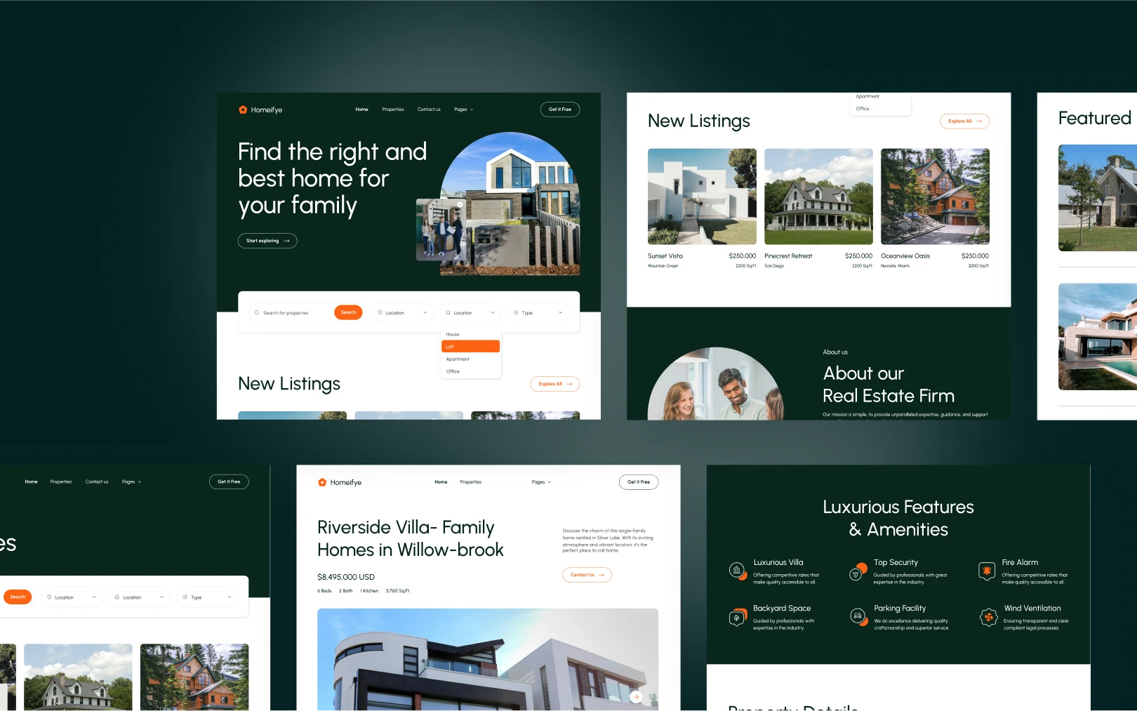
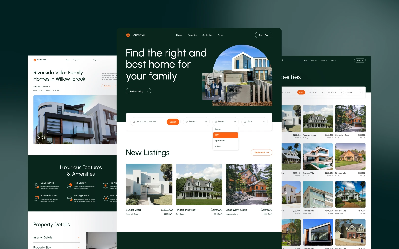
Homeifye is a premium real estate web template (by Flowfye, built on Webflow) whose visual identity balances trust and warmth. The deep forest green primary (#09261D) — appearing in dark hero bands, footers, and interactive overlays — conveys stability and sophistication. The vibrant orange secondary (#FF6314) acts as the sole accent, driving every interactive call-to-action and search element with high energy. A near-white tertiary (#F7F5F0) supplies warmth to light sections without going clinical. The result is a palette that feels grounded yet approachable — appropriate for an audience making significant financial decisions.
Colors
Typography
h1
h2
h3
h4
body-lg
body-md
body-sm
caption
button-label
button-label-bold
Spacing
Rounded & Borders
Shadows & Elevation
Components
button primary
button primary hover
button outline
button outline hover
property card
property card image
property card hover
search bar
search button
faq accordion
footer link
footer link hover
section dark
section light
Do's & Don'ts
Do's
- Use orange (#FF6314) sparingly and only for interaction. It should be the most visually distinct element on any screen — reserved for primary CTAs and active states.
- Maintain the dark/light section rhythm. The visual identity depends on alternating between
primarygreen andneutralwhite sections to create pacing. - Keep typography weights to 400/500/700. Urbanist's character comes from its geometry, not from weight variation. Adding 600 or 300 breaks the system.
- Use pill-shaped radius (99px) for all interactive elements. Buttons and search inputs should always be fully rounded.
- Apply 8px radius to property card images. This is the consistent treatment across all card imagery.
- Keep letter-spacing at
normal. The design deliberately avoids tracking adjustments — the geometry of Urbanist handles spacing naturally.
Don'ts
- Don't use orange as a section background. It is an accent only; large orange areas will overwhelm the calm green/white base.
- Don't add shadows to resting cards on white backgrounds. Shadows are reserved for hover states and dark sections only.
- Don't introduce a second typeface. The entire system runs on Urbanist — mixing in another sans-serif (Inter, Poppins, etc.) will dilute the identity.
- Don't use weight 500 for body text. Body copy is always 400; headings are always 500; buttons are always 700. Crossing these assignments breaks hierarchy.
- Don't round content cards beyond 8px. Larger radii on cards create visual conflict with the pill-shaped buttons.
- Don't use pure black (#000) for text. The primary green (#09261D) is the text color — it is intentionally warmer and softer than true black.
Join the New Era of Web Creators

Product


Our Brand




© 2026 Pagifye. All rights reserved.