Growfye
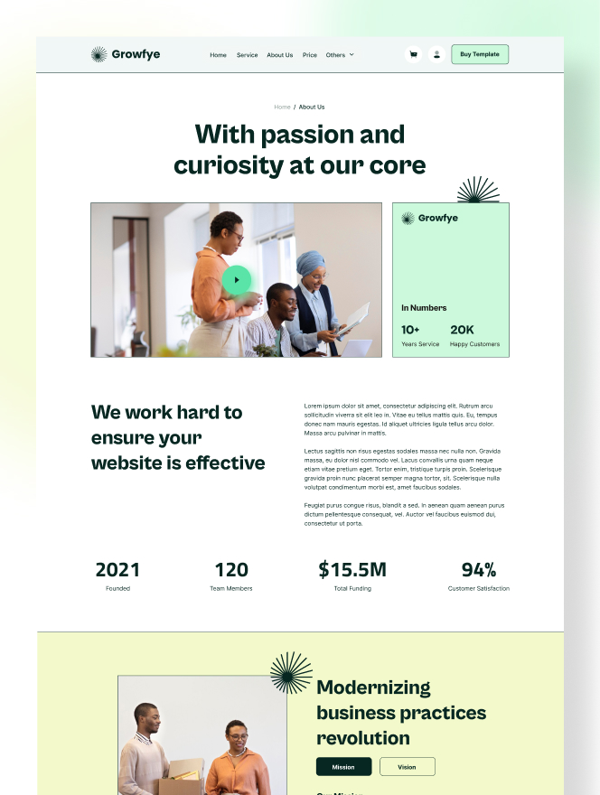
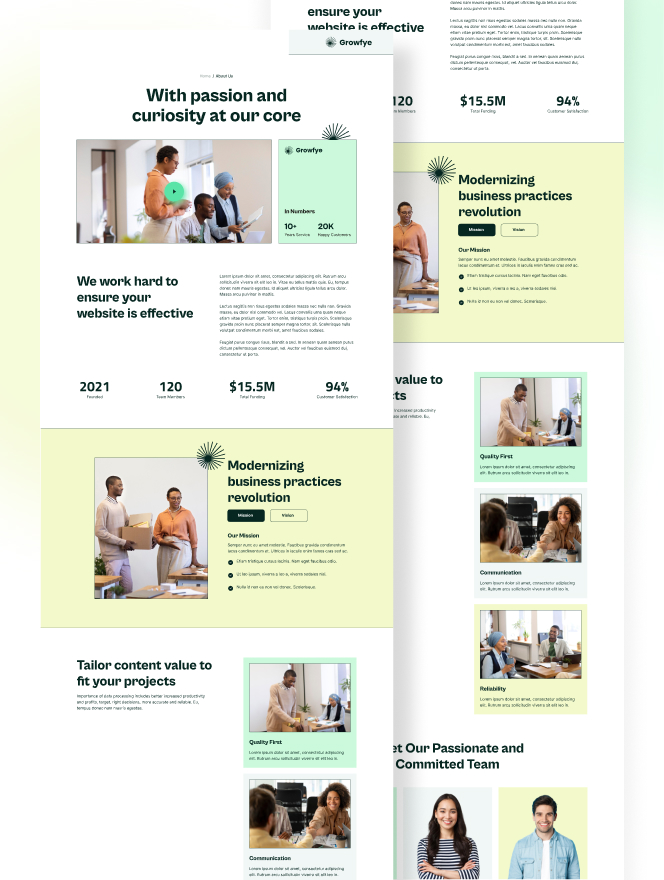
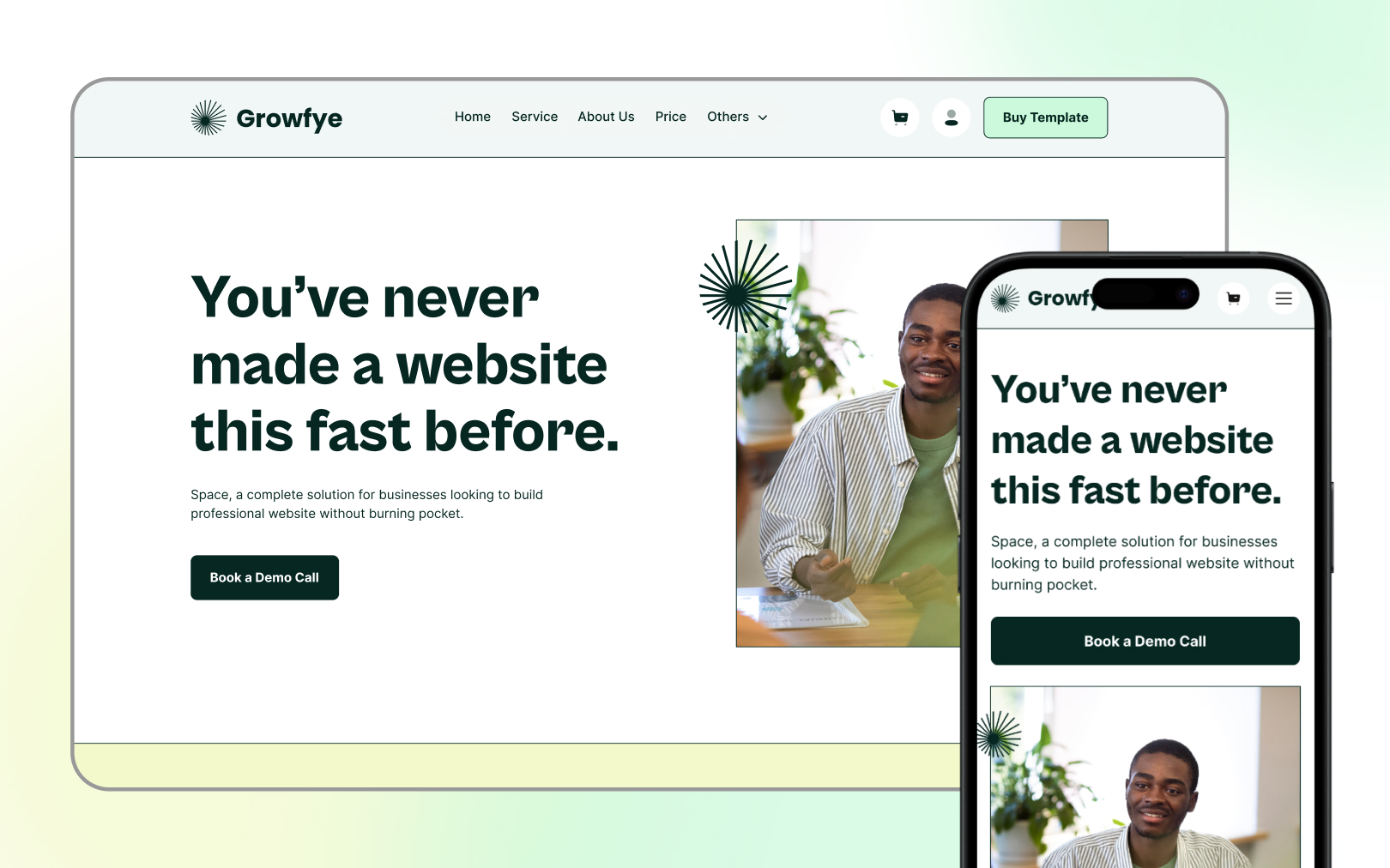
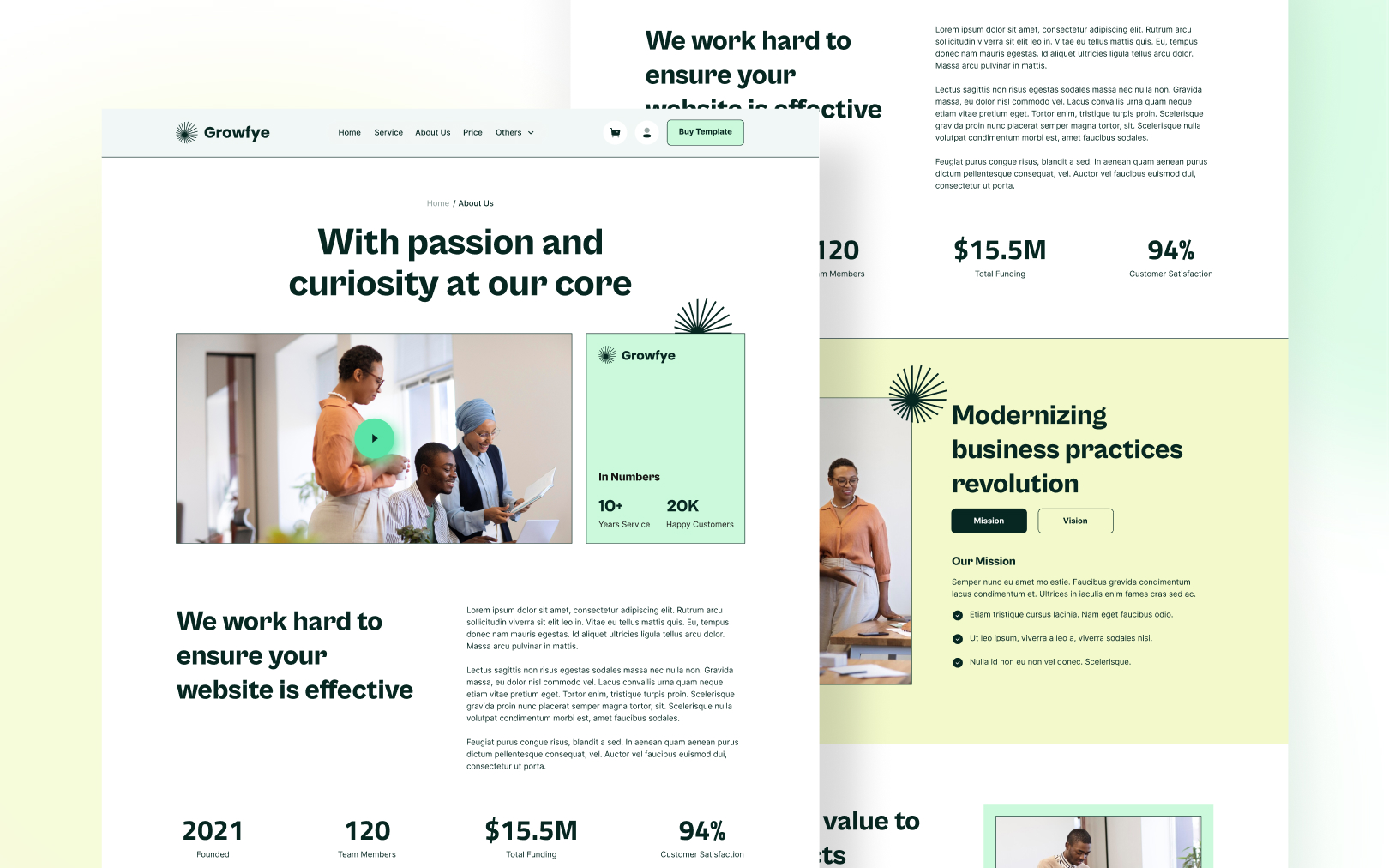
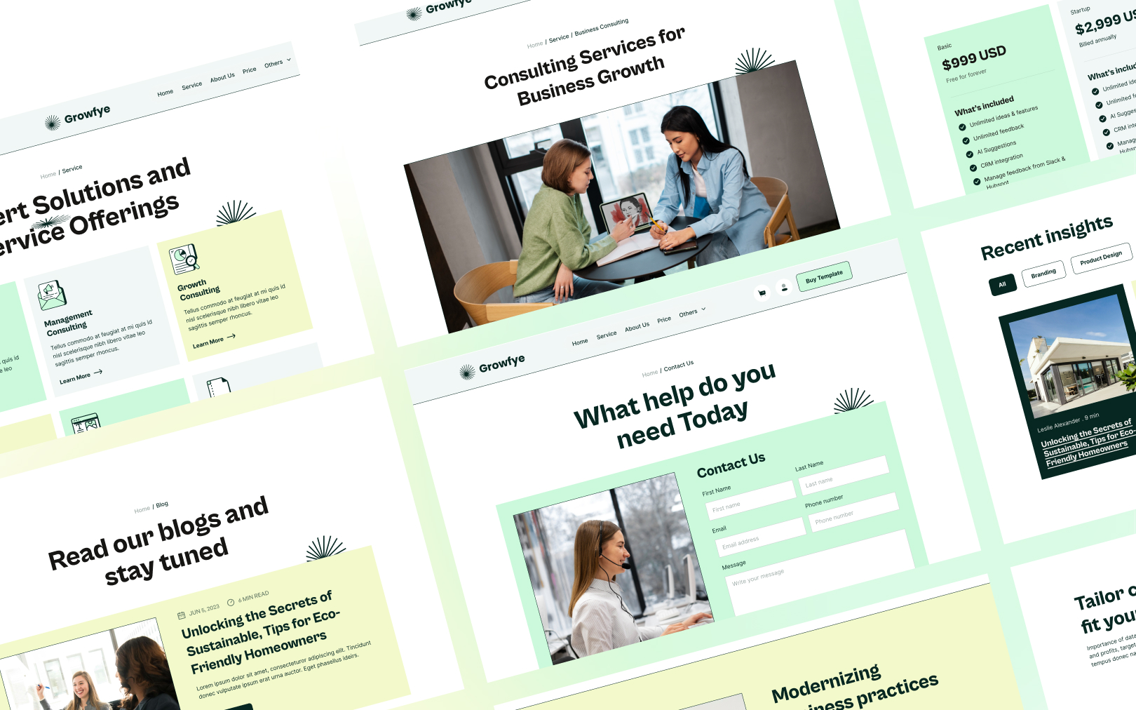
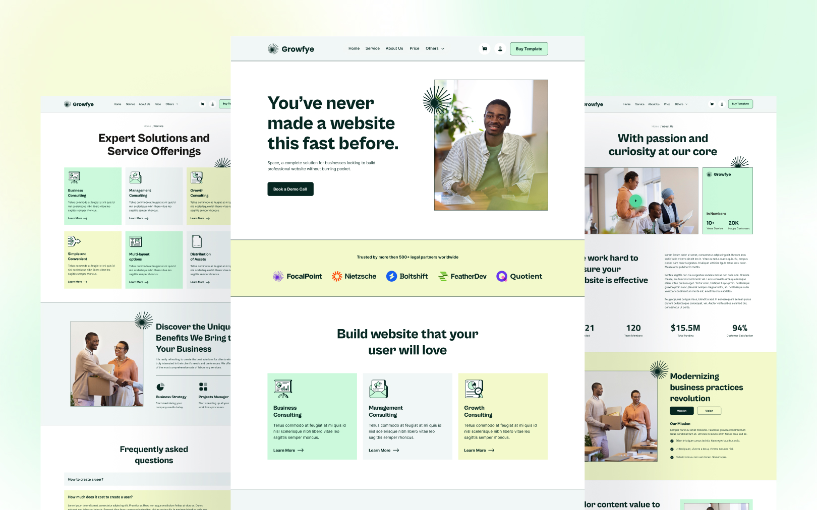
Contemporary business template, editorial forest-green palette, warm pastel section bands, and Cabinet-Grotesk display type.

Overview
Growfye is a contemporary business/consulting template that pairs editorial
restraint with warm, approachable color banding. The identity is built
around a single deep forest-green ink (#062721) that carries all text,
headings, and high-emphasis actions — there is no separate "brand accent"
color. Visual interest comes instead from alternating full-width section
backgrounds in three soft pastels (grey, mint, chartreuse), creating a
rhythmic scroll cadence without competing with content.
The type system splits duties between two families: Cabinet-Grotesk for display headings (h1–h3), chosen for its geometric warmth and tight display tracking; Inter for all body text, labels, and UI chrome, chosen for its screen-optimised legibility at 16px. The contrast between a characterful grotesk and a neutral neo-grotesque is the typographic signature.
Colors
Typography
h1
h2
h3
body-md
body-sm
label
Spacing
Rounded & Borders
Components
button primary
button primary hover
button secondary
card
surface grey
surface mint
surface chartreuse
status success
status error
nav
Do's & Don'ts
- Do alternate section backgrounds using the
surface-*tokens — the color-band rhythm is the layout's signature device. - Do keep
#062721as the only text color. The green-ink-on-pastel contrast is the palette's unifying principle. - Do use Cabinet-Grotesk exclusively for headings (h1–h3) and Inter exclusively for body and UI.
- Don't introduce additional accent colors. If a new state is needed,
use
successorerror— do not create a sixth brand color. - Don't use fully-rounded pills on buttons. The 8px radius is intentional and distinguishes Growfye from consumer/playful templates.
- Don't nest component variants. Define
button-primary-hoveras a sibling, not as a child ofbutton-primary. - Don't set body text below
0.875rem(14px) — thebody-smtoken is the floor. - Accessibility caveat: The
status-errorbadge (#062721text on#E94D35fill) measures 4.23:1 — just below the WCAG AA 4.5:1 threshold. This is inherited from the source template's error token. For strict AA compliance, darkenerrorto#D13D26or useerroronly as a border/ icon color withprimarytext on aneutralbackground.

Join the New Era of Web Creators

Product


Our Brand




© 2026 Pagifye. All rights reserved.