Clinova
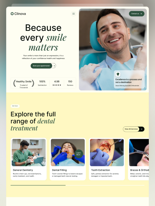
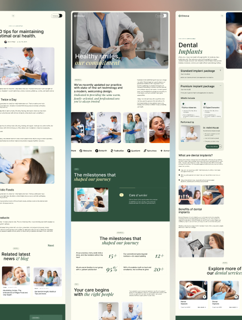
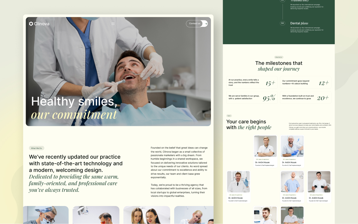
Warm, editorial dental-clinic identity pairing a deep forest-green accent with cream surfaces and sharp-cornered imagery, wellness, not clinical sterility.
Overview
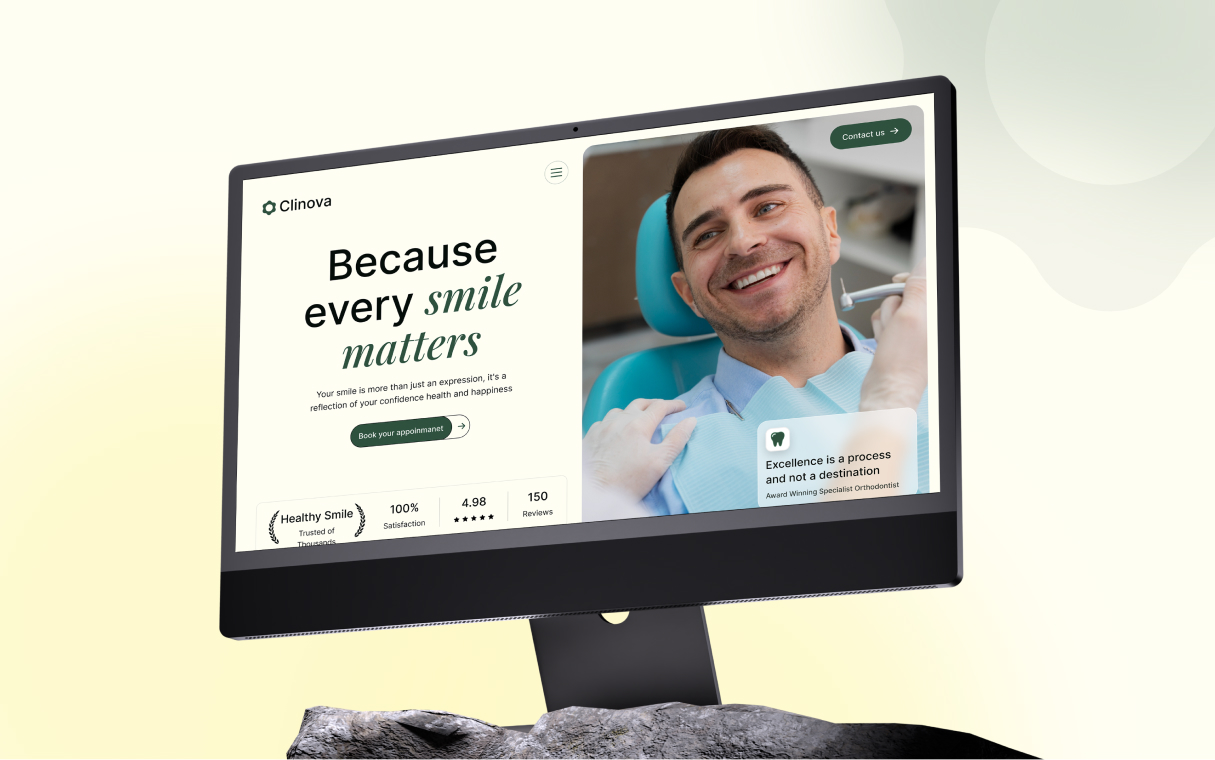
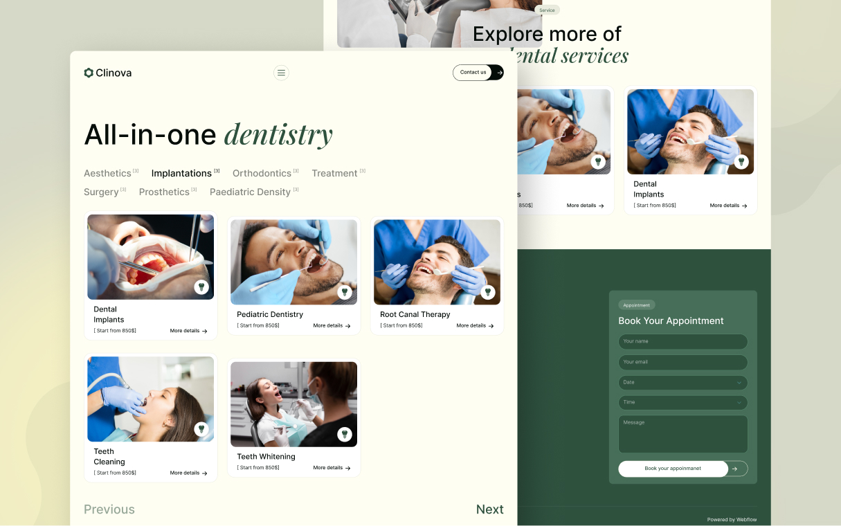
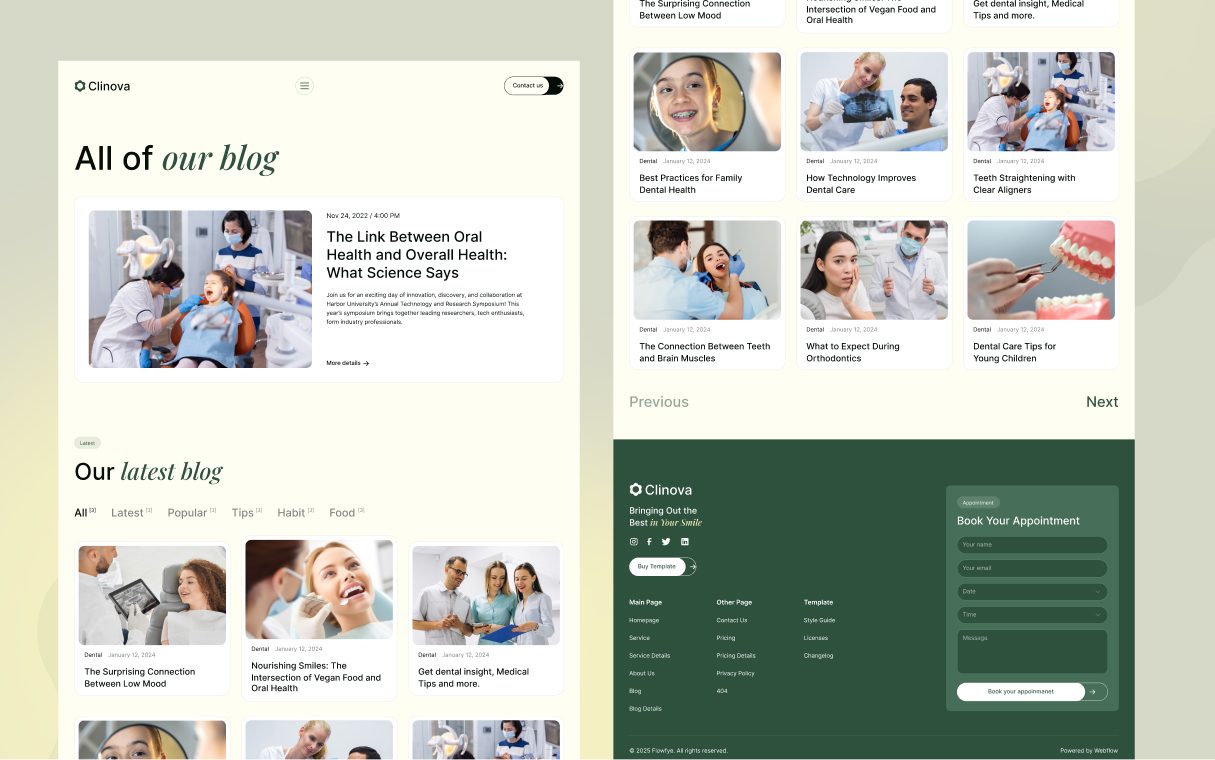
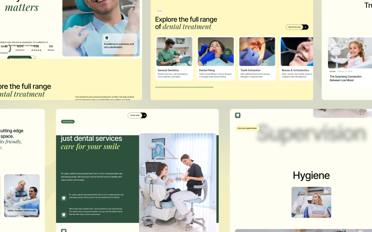
Clinova is a dental-clinic template that deliberately rejects the "clinical blue" convention. Instead it reaches for a warm, editorial wellness aesthetic — a deep forest green paired with cream and warm off-white surfaces, sharp-cornered photography, and an italic serif accent that humanises an otherwise all-sans-serif system.
The emotional goal is trust through calm: the palette evokes nature, health, and organic care rather than sterile medical environments. Generous type sizes, medium (not bold) heading weights, and pill-shaped interactive elements create an approachable, boutique-clinic feel. The single serif italic word in the hero ("smile matters") is the brand's signature flourish — used once, never repeated, never diluted.
Colors
Typography
h1
h1-accent
h2
h3
body-lg
body-md
label
button
Spacing
Rounded & Borders
Shadows & Elevation
Clinova is deliberately flat. There are no box shadows, no drop shadows, no glassmorphism, no frosted overlays. Depth is communicated entirely through:
- Surface colour changes — stepping from neutral to tertiary to primary
- Hairline borders — 1px solid in the surface's own on-color (e.g., white
border on dark buttons,
#548168border on green-section form inputs) - Image scale animation — subtle zoom on hover (CSS transform, not shadow)
Resist the urge to add shadows. The flatness is the point — it reads as confident, editorial, and modern.
Components
page surface
button primary
button outline
button on primary
button on dark
tag pill
tag pill on dark
info card
testimonial card
service card
form input
scroll thumb
divider
Do's & Don'ts
- Do keep Playfair Display to one italic accent per page. It loses power through repetition.
- Do alternate neutral and tertiary section backgrounds to create rhythm.
- Do keep heading weights at 500. Going to 700 makes the design feel heavier than intended.
- Do use 99px pill radius exclusively for interactive elements (buttons, inputs, tags). Content surfaces stay sharp.
- Don't introduce blues, teals, or cool greys. Clinova's palette is entirely warm — adding a cool tone breaks the wellness signal.
- Don't use pure white (#FFFFFF) as a page background. Always use neutral (#FFFEF3). The warmth is deliberate.
- Don't add box shadows or elevation. Depth comes from colour tiers, not shadows.
- Don't uppercase the eyebrow labels. They are sentence-case and colour-coded — that is the Clinova way.
- Don't nest component variants.
button-primary-hoveris a sibling key, not a child ofbutton-primary.

Join the New Era of Web Creators

Product


Our Brand




© 2026 Pagifye. All rights reserved.