Brixsa
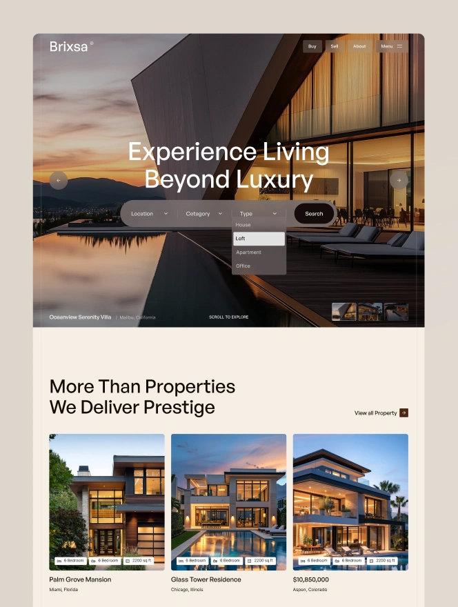
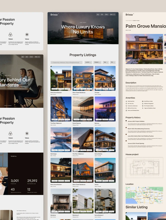
Warm, editorial luxury real estate, espresso-black and cream with forest-green and walnut accents, driven by GeneralSans display type.
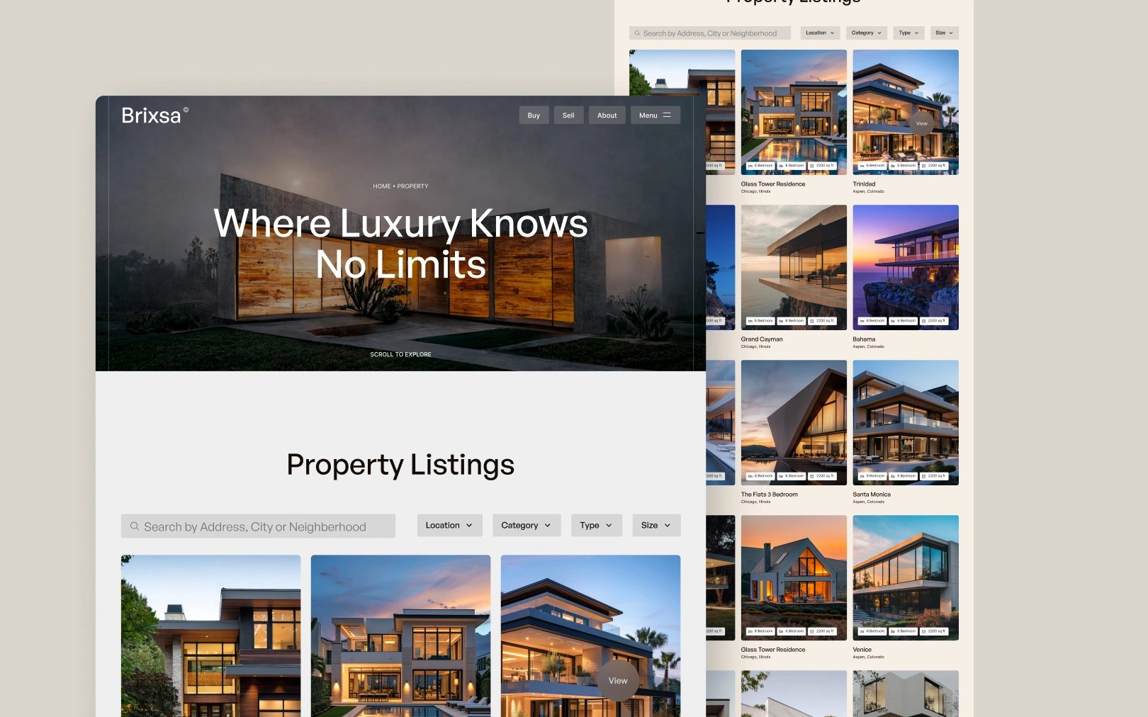
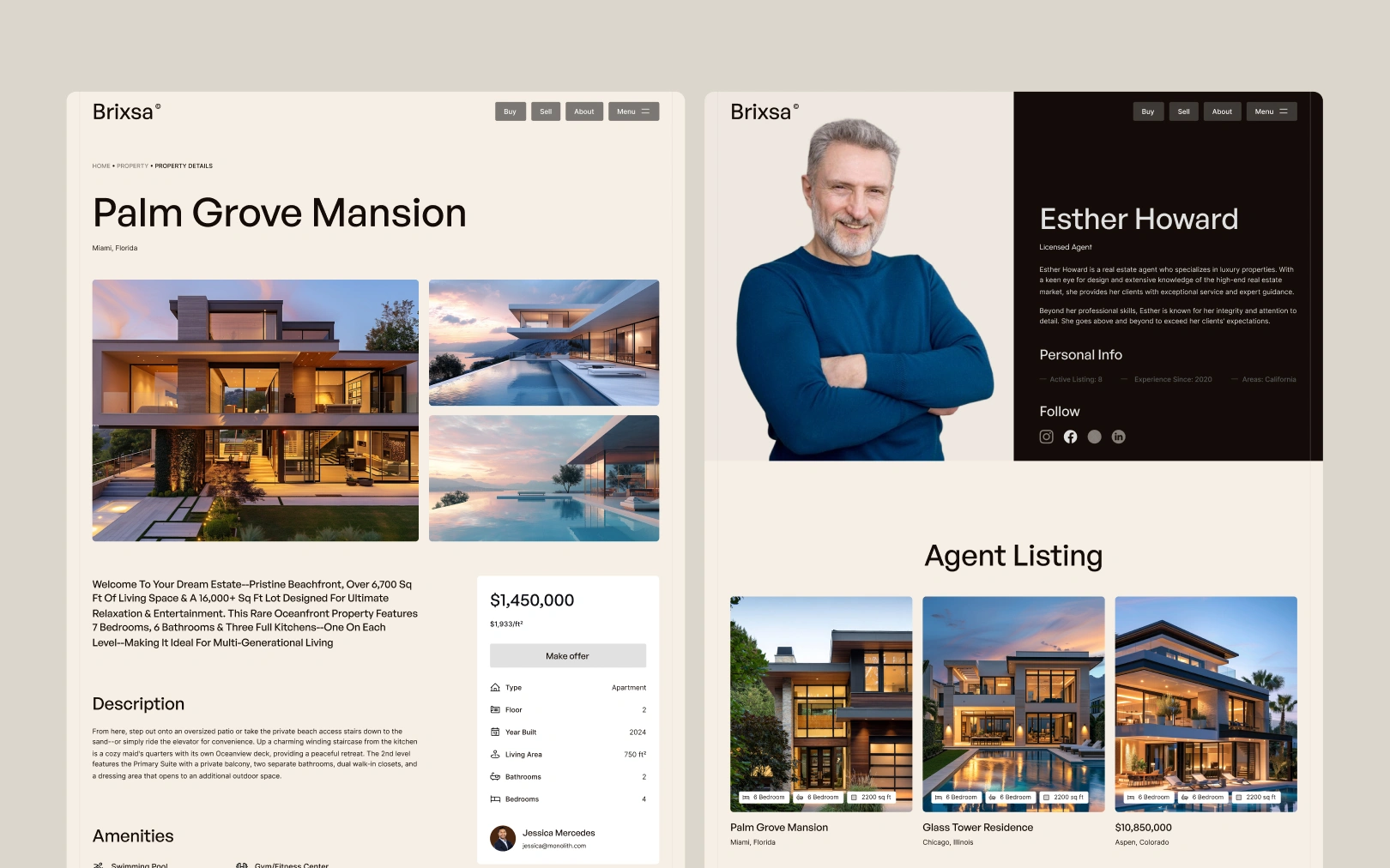
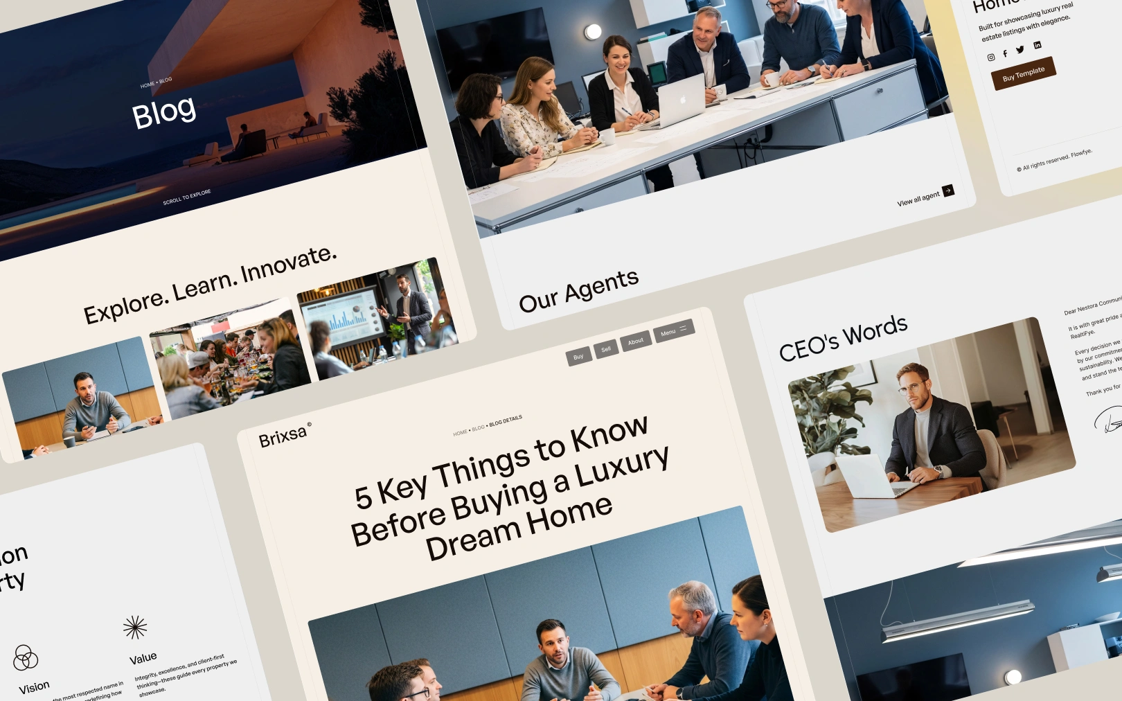
Overview
Brixsa is a luxury real estate template that pairs warm editorial restraint
with confident high-contrast sections. The dominant feeling is cream and
espresso — a paper-like background (#F6EFE5) anchored by near-black ink
(#140C08) — punctuated by deep forest-green and walnut-brown accents borrowed
from architectural photography. Type does the heavy lifting: GeneralSans
Variable at weight 500 for all display sizes (capitalized), Inter Variable
for body and UI. There are no decorative fonts, no gradients, and no shadows of
note; hierarchy comes from scale, color inversion, and generous whitespace.
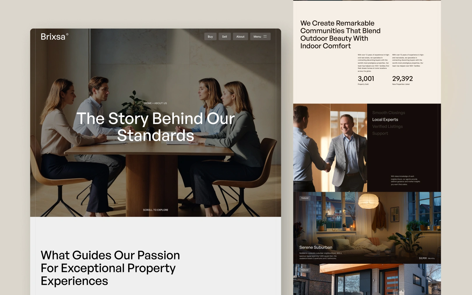
The site alternates between light sections (cream bg, dark text) and full-bleed dark sections (espresso bg, soft-white text). This rhythm — light → dark → light → dark — is the primary structural device. The dark sections host testimonials, location galleries, and the closing CTA; the light sections host listings, services, and editorial content.
Colors
Typography
h1
h2
h3
body-md
body-lg
display-quote
label
button-label
Spacing
Rounded & Borders
Shadows & Elevation
Brixsa deliberately avoids box shadows and artificial depth. Instead, depth is created through:
- Background-color contrast — light cards (
#FFFAF3) sit on cream (#F6EFE5); dark sections invert fully. - Overlay opacity — hero images use a
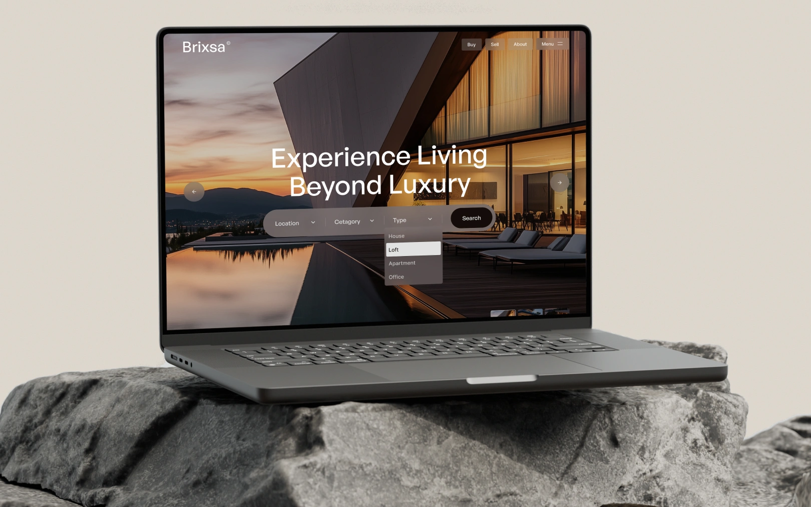
rgba(0,0,0,0.5)overlay to separate imagery from text; the property search bar usesrgba(128,117,117,0.5)— a frosted-glass effect on the hero image. - Color temperature — warm browns and greens recede; espresso black advances. This creates perceived layering without pixel-based shadows.
Do not add box-shadow to components. If a surface needs to feel elevated,
change its background color within the palette.
Components
button primary
button dark
badge featured
search bar
property card
section light
section green
section brown
section dark
Do's & Don'ts
- Do maintain the light → dark → light section rhythm. It is the primary structural device and what makes the design feel editorial rather than utilitarian.
- Do use GeneralSans for every heading and Inter for every body/UI element. No third typeface.
- Do keep
text-transform: capitalizeon H1 and H2 — it is part of the editorial voice. - Do use token references (
{colors.primary}) in component definitions instead of re-typing hex values. - Don't add box shadows. Depth comes from background-color contrast and overlay opacity, not pixel shadows.
- Don't use pure black (
#000000) or pure white (#FFFFFF) for surfaces. The warm undertones in#140C08,#F6EFE5, and#E1E1E1are intentional and load-bearing to the aesthetic. (Pure white is acceptable only for text on dark/green/brown accent backgrounds.) - Don't introduce accent colors outside the green/brown family. The palette is deliberately earth-toned; a blue or purple accent would break it.
- Don't nest component variants.
button-primary-hoveris a sibling key, not a child ofbutton-primary. - Don't use rounded corners larger than 4px on cards or buttons outside the search/filter context. The 20px+ radii are reserved for the hero search bar and pill action buttons.

Join the New Era of Web Creators

Product


Our Brand




© 2026 Pagifye. All rights reserved.