Aquafix
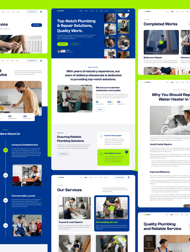
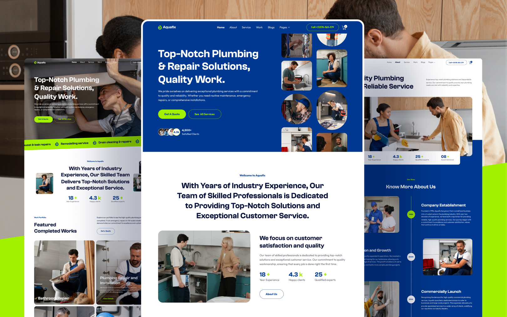
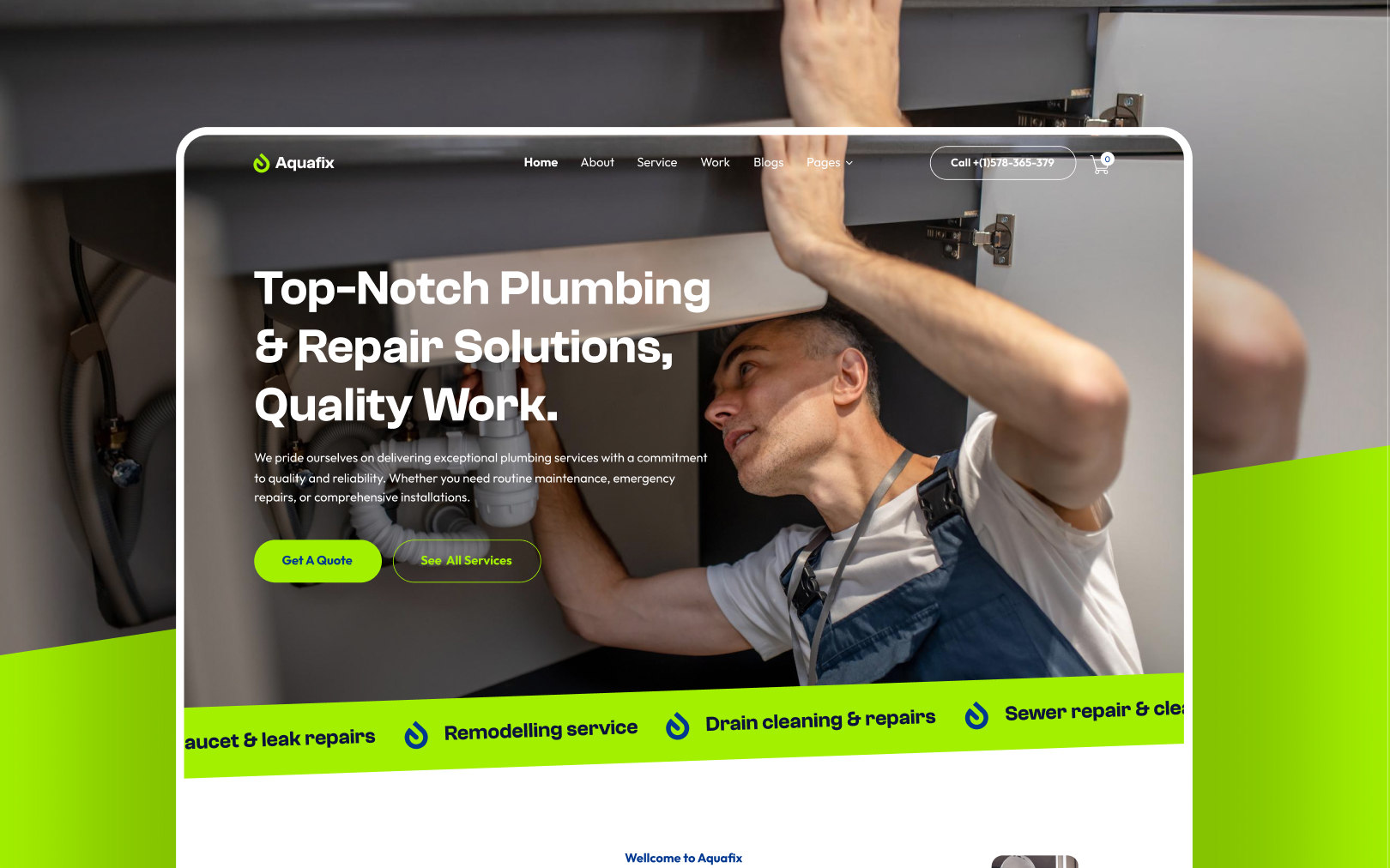
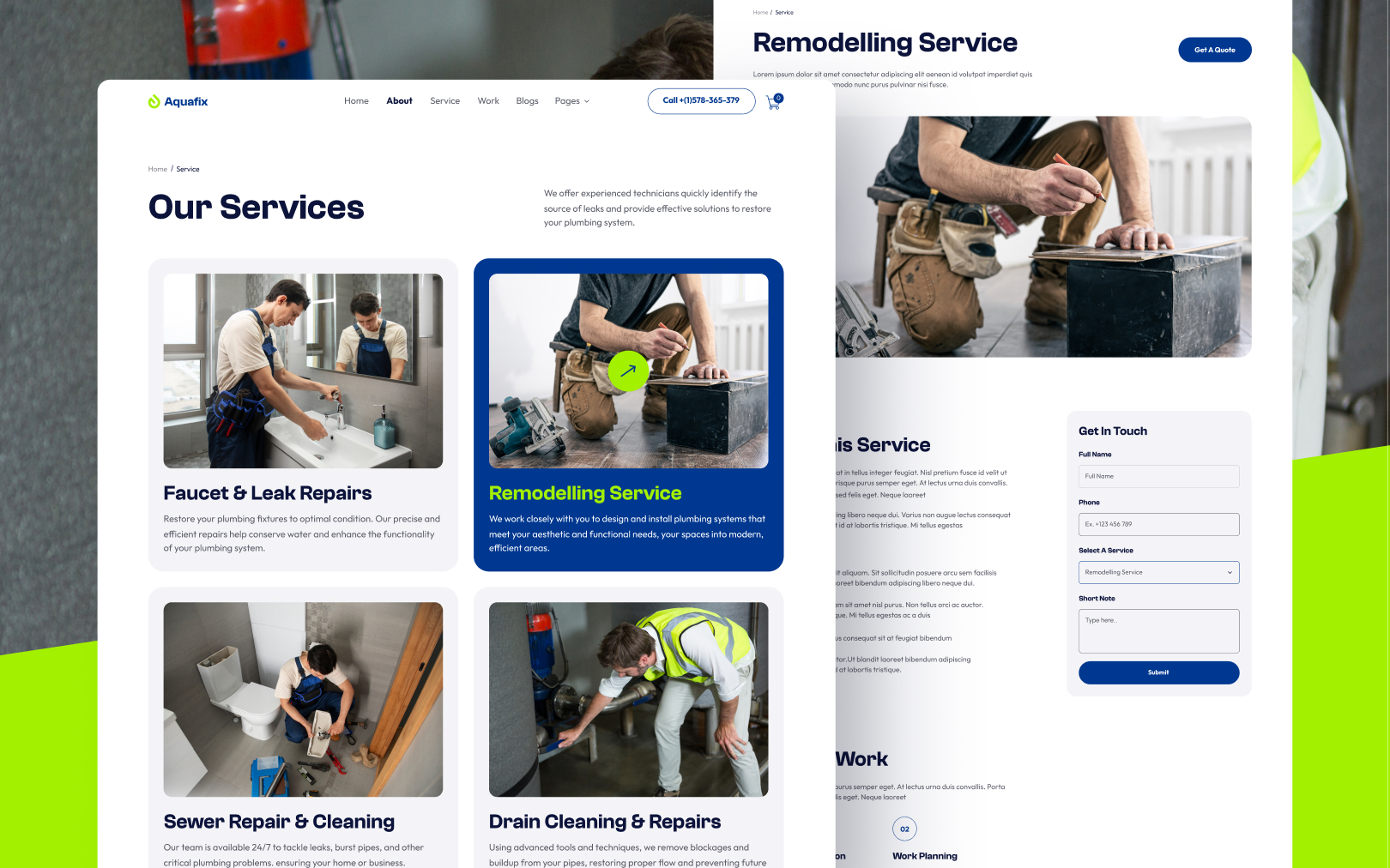
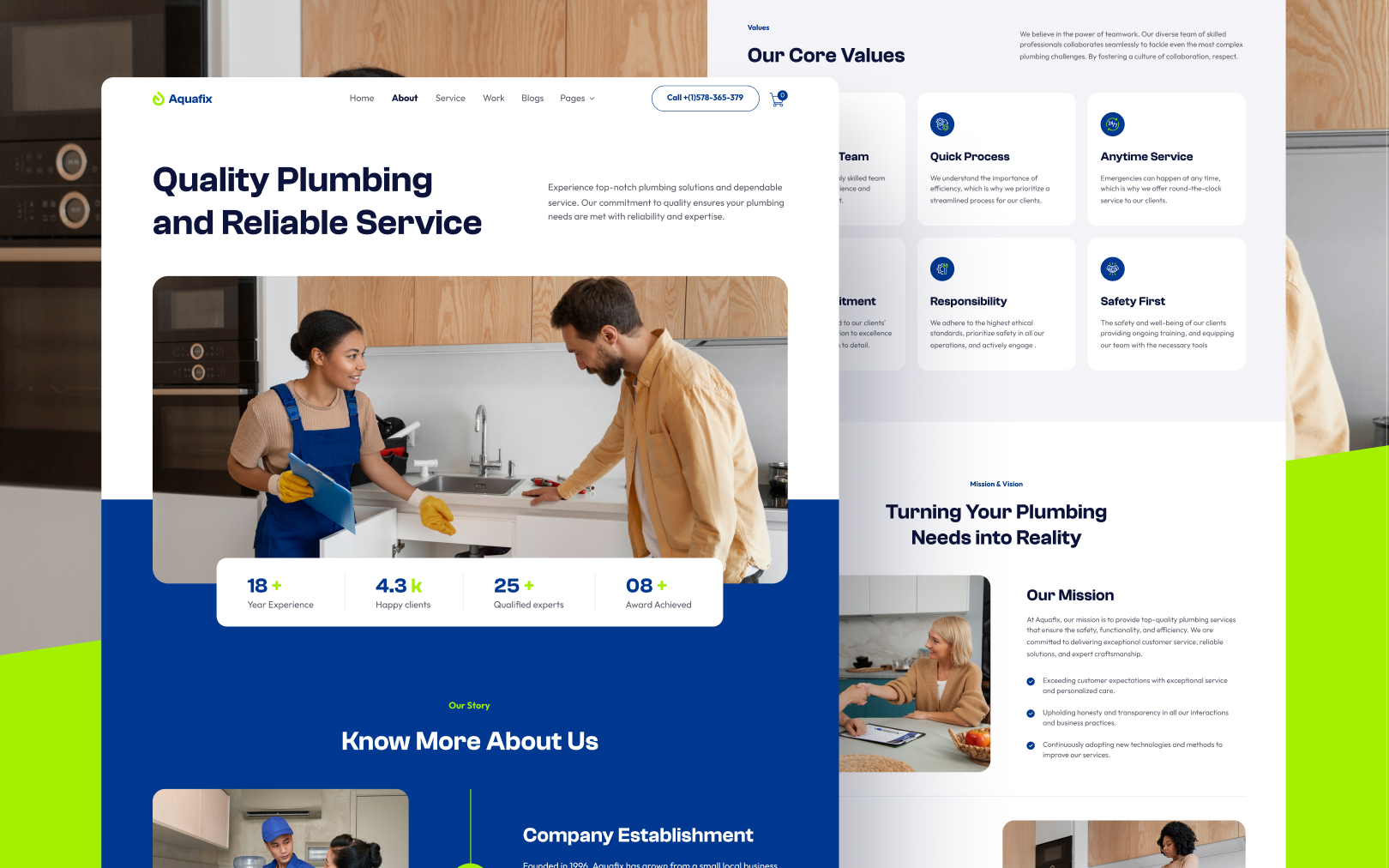
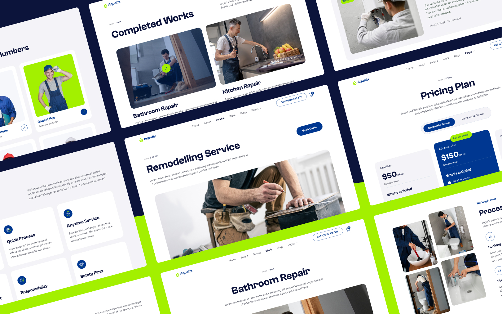
Bold plumbing-service brand pairing deep navy authority with electric lime energy.

Overview
Aquafix is a plumbing-service brand built on authority and energy. Deep navy
({colors.primary}) carries institutional trust — the colour of water, depth, and
reliability — while electric lime ({colors.tertiary}) injects an unmistakable
call-to-action signal that cuts through a traditionally conservative industry.
The pairing is deliberately high-contrast: the brand wants to feel modern and
confident, not like a generic contractor listing.
Two typefaces reinforce the split personality. Clash Grotesk (a geometric display grotesque) handles every heading with tightly engineered letterforms that feel architectural and precise. Outfit (a humanist sans) carries all body and UI text with warmth and legibility at small sizes. Together they create a hierarchy where headlines command attention by shape, not just size.
Colors
Typography
h1
h2
h3
body-md
button-label
section-label
Spacing
Rounded & Borders
Shadows & Elevation
Components
button primary
button primary hover
button secondary
button secondary hover
card service
card feature
divider line
header bar
footer bar
badge accent
Do's & Don'ts
- Do use
{colors.tertiary}(lime) exclusively for primary actions and key accent moments. Its power comes from scarcity. - Do keep heading weight at 600 — size creates hierarchy, not weight changes.
- Do maintain generous section padding (
section-mdminimum). The brand trades on confidence and space. - Don't introduce colours outside this palette. Extend the
colors:tokens first, then reference. - Don't add drop shadows to default cards or sections. Reserve
card-shadowfor genuinely elevated elements. - Don't use serif or monospace fonts. Clash Grotesk + Outfit is the complete type system.
- Don't nest component variants.
button-primary-hoveris a sibling key, not a child ofbutton-primary.
Join the New Era of Web Creators

Product


Our Brand




© 2026 Pagifye. All rights reserved.