Advorus
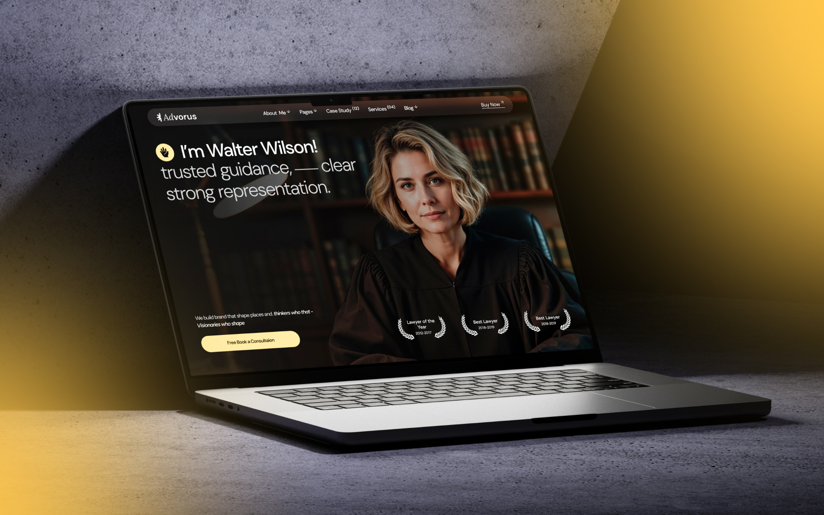
Editorial legal authority with a warm metallic accent, dark ink surfaces paired with a signature mustard gold.
Overview
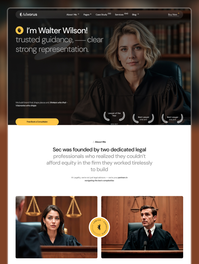
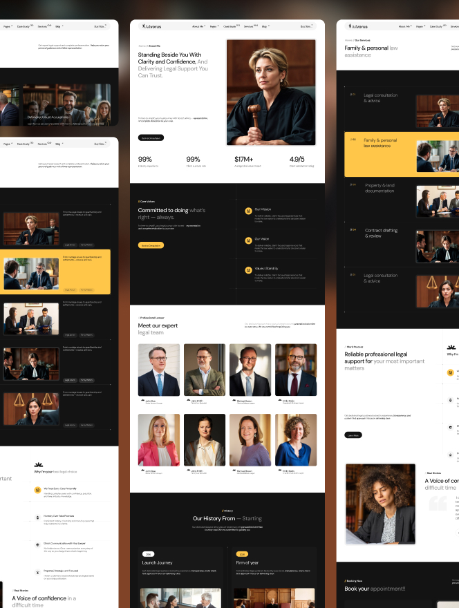
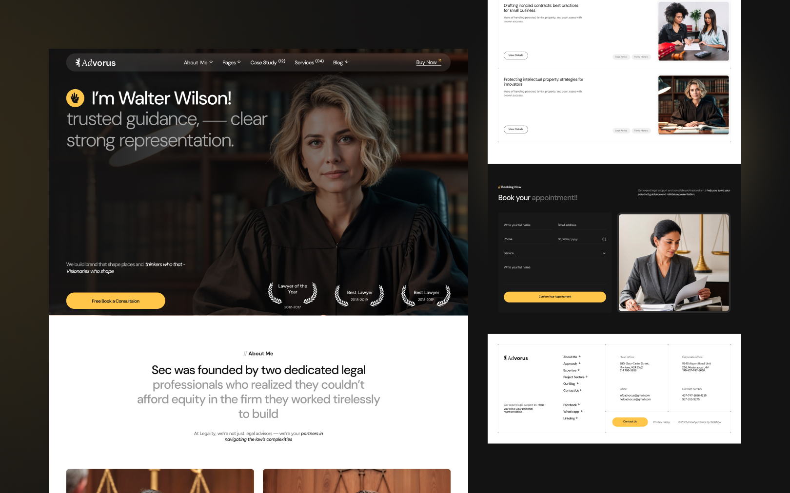
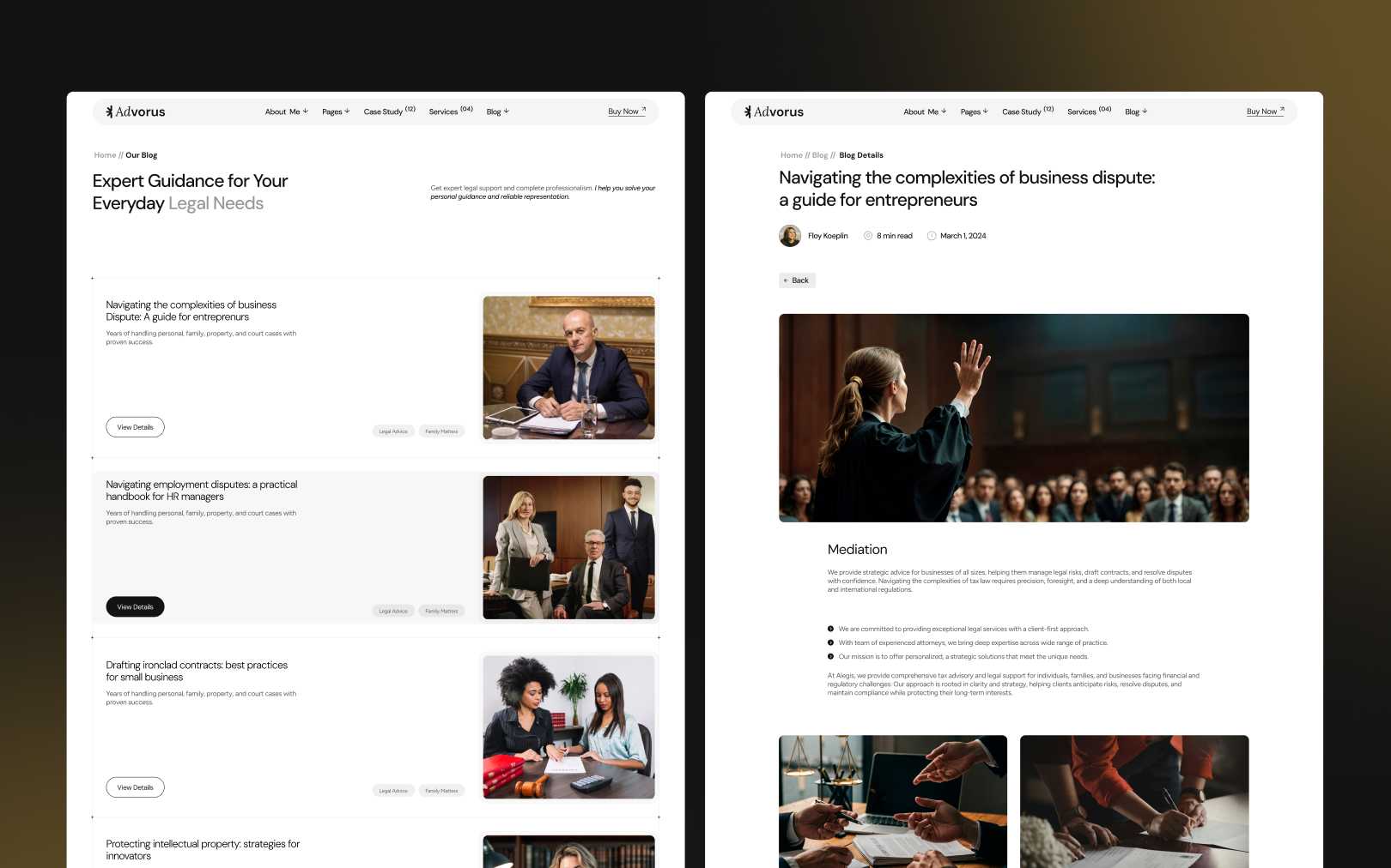
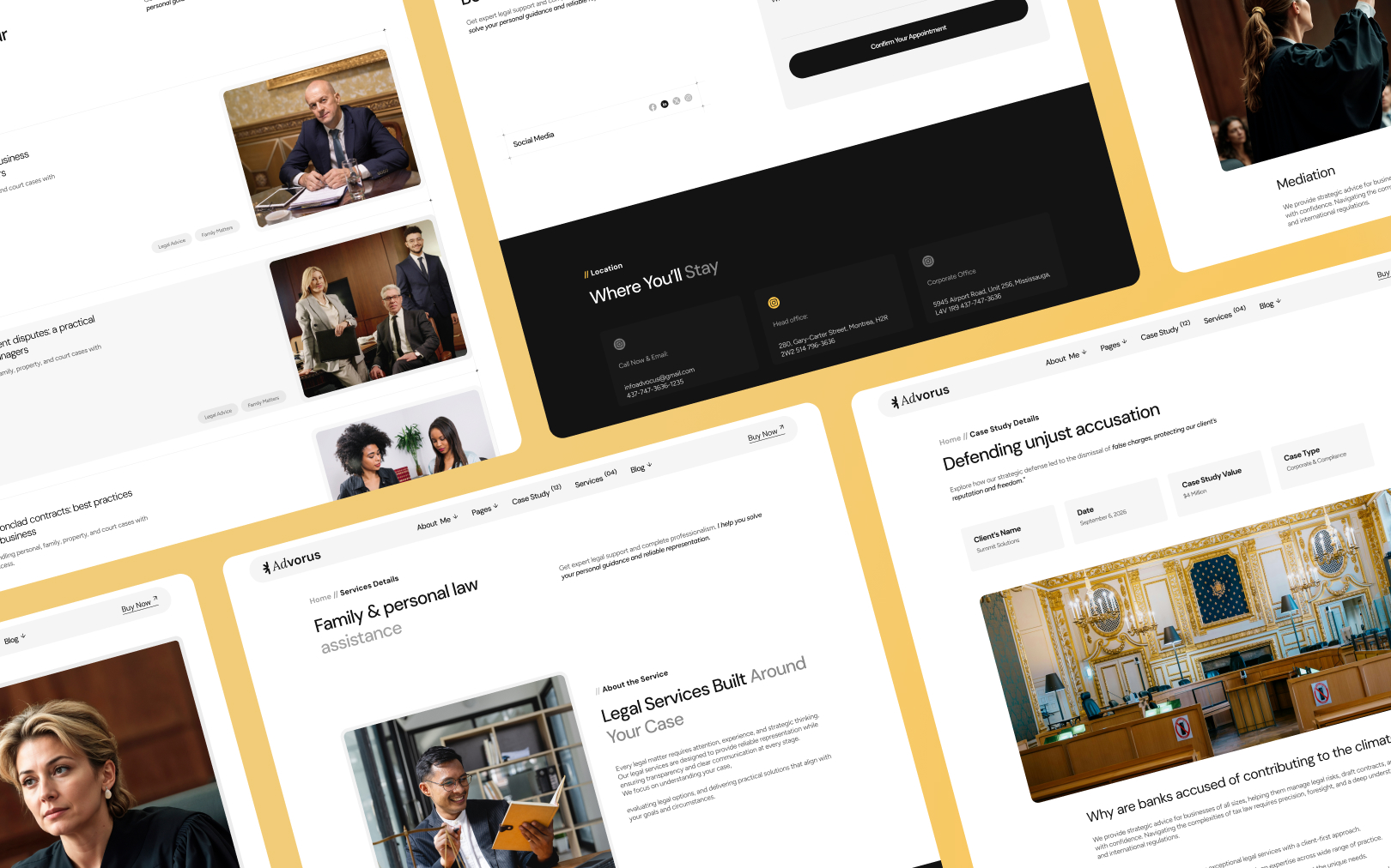
Advorus is a legal-services brand built on editorial gravitas with a warm
metallic pulse. The page alternates between pure-white sections and near-black
ink fields (#131313), creating a rhythm that feels like a printed legal
journal — confident, structured, and authoritative. A single accent — mustard
gold (#FFC64A) — cuts through the monochrome as the sole interaction driver:
buttons, nav bars, stat counters, and icon strokes. There are no secondary
accents. The discipline of using one warm tone against a black-and-white
foundation is the core of the brand's identity.
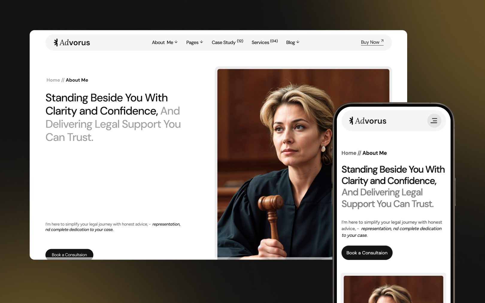
The mood is serious but human — not cold corporate law, not aggressive litigation. DM Sans (a geometric grotesque) carries all headings and labels at medium weight with tight negative tracking, giving headlines a modern, approachable quality. Oaksans handles body copy at 18px with generous leading, maintaining readability for long-form legal guidance.
Colors
Typography
h1
h2
h3
h3-emphasis
body-md
body-light
eyebrow
button-label
Spacing
Rounded & Borders
Shadows & Elevation
Shadows are absent. The entire depth system relies on background-color contrast between adjacent sections and surface fills. Dark sections feel "recessed" relative to white sections purely through the light/dark alternation.
The only depth cue beyond color is the hero gradient overlay: a 90°
left-to-right gradient from rgba(19,19,19,0.94) to rgba(19,19,19,0.9) fading
to transparent, ensuring white headline text remains legible over the hero
background image.
The site uses GSAP-powered text animations — headline text is split into
individual letters (gsap_split_letter classes) for staggered reveal on load.
Counter numbers animate from 0 to target on scroll-into-view. Motion is
restrained: no parallax, no card-flip, no 3D transforms. The aesthetic is
"editorial page-turn" not "interactive showcase."
Components
button primary
button primary hover
button ghost
card dark
card light
input field
eyebrow label
footer text
stat number
section dark
section light
Do's & Don'ts
- Do maintain the light/dark section alternation. It is the primary structural rhythm — breaking it flattens the page into monotony.
- Do use mustard gold (
#FFC64A) exclusively for interaction, emphasis, and data viz. It loses signal if used decoratively. - Do keep button radius at
full(pill) and card radius at0px(square). The contrast is intentional. - Don't introduce a second accent color. The entire palette is black, white, grey, and one gold. Adding blue, green, or red breaks the brand.
- Don't use bold (700) weight for headings. Medium (500) is the brand voice — bold reads as aggressive, which contradicts the "partner" tone.
- Don't add drop shadows to cards or buttons. Depth comes from color contrast alone.
- Don't use serif fonts. The design is fully sans-serif by intent — serifs would shift it toward traditional-law-firm territory.
Join the New Era of Web Creators

Product


Our Brand




© 2026 Pagifye. All rights reserved.